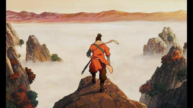
Adapting a popular title *and* a videogame at that would often shackle creative teams, which is why it fucking rules that Sekiro decided to throw common sense out the window & double down on something this radical
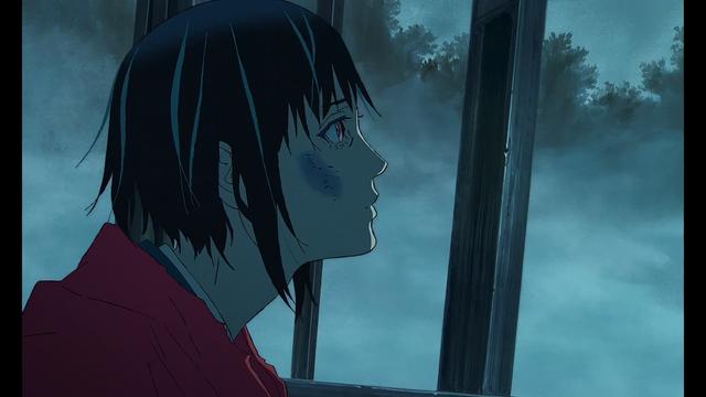
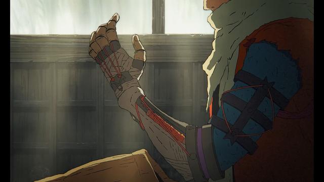
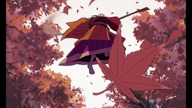
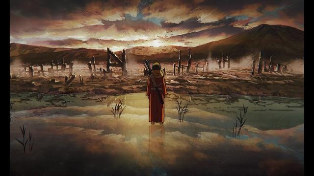
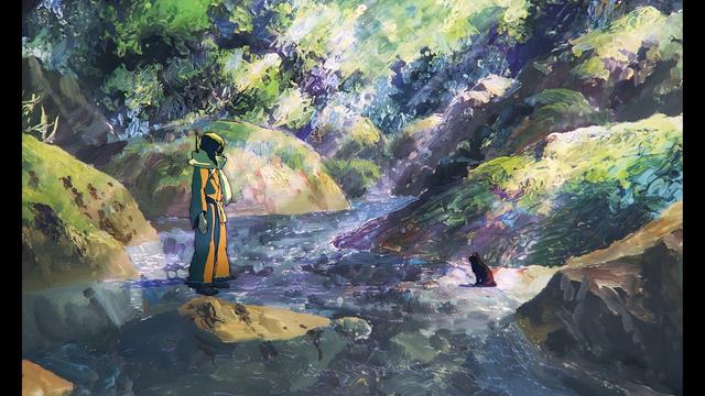
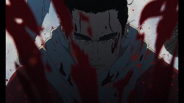
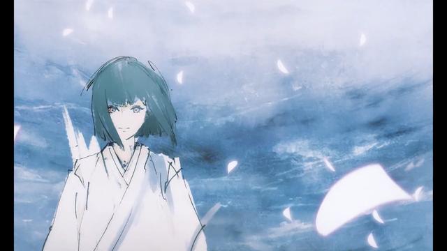
Coosun's irreverent approach & color sensibilities mix with idiosyncratic veterans to form a style that feels familiar in spots - The Hakkenden #10 vibes and occasional Nijiiro Hotaru-esque linework, for example. As a whole, though, one of its greatest strengths is not being quite like anything else
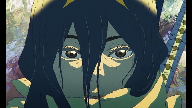
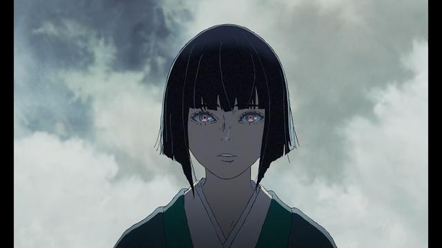
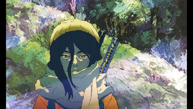
The colors are interesting. Not only is it the clearest Kutsuna trait, it's also especially neat here in how often it incorporates a color or two that feel extraneous to the palette otherwise. Striking accents facilitated by the designs themselves, which incorporate those dashes into their outfits