How to explain modern American politics in one chart

How to explain modern American politics in one chart
@KeithWM The percentage is of the total volume of dollars contributed, not the number of contributors.
https://americansfortaxfairness.org/billionaires-buying-elections-theyve-come-to-collect/
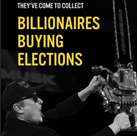
KEY FINDINGS Just 100 billionaire families poured a record-breaking $2.6 billion into federal elections in 2024, one of every six dollars spent altogether by all candidates, parties and committees. That’s two-and-a-half times the roughly $1 billion spent by individual billionaire donors in 2020. Billionaire political spending is up 160-fold since the Supreme Court’s 2010 Citizens …
@jalefkowit I understood that. But if you're simply checking if someone's wealth (by some measure) if over a billion and counting only those donations, overall inflation and increasing imbalance in distribution of wealth will give an increase in their share, even if it's the exact same people donating the same relative share.
Not really to argue the point of the graph, but it's shaky.