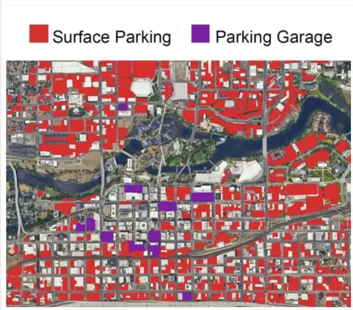
Downtown Spokane, Washington. The red areas represent surface parking lots, while the purple ones indicate parking garages

https://sh.itjust.works/post/56435742

Why the highlighting? Is one more terrible than the other? If so, which one?
The point is to illustrate how much of our cities car-centric infrastructure has destroyed.
If that’s the case no red vs purple is needed. People need to learn how to visualise data to make a point
The differentiation into two categories with two colors add additional information and make it even more interesting without diminishing the actual point of the visualization.