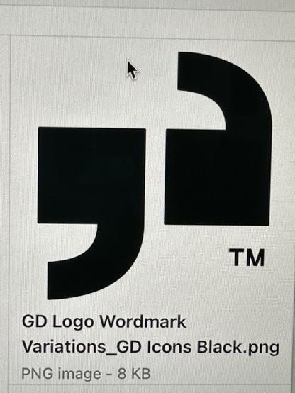
i came across this logo today. those single quotes seem so wrong. wtf is going on here? i know there are type nerds on here. is there something i'm missing or did they really fuck these up so badly?

@palomakop Maybe someone was super clever and thought they resemble:

gd

@reimar god damn, i think you're right.
@palomakop haha I was just guessing
@palomakop And now I start to think it’s weirdly brilliant πŸ™ƒ
@reimar lmao it bothers me so much even knowing they had a Concept
@palomakop And … damn … I really like it now haha. What a twist
@palomakop @reimar whoever they hired did half the work and doubled the fee (good on them)
@palomakop @reimar
Maybe now people will stop talking about the fedex arrow.

@palomakop they're just... completely wrong; the left one should be bottom weighted and curling inward (so it's flipped in both directions) and the right is upside down

they should form a yin and yang-style circle that "encloses" the quote itself

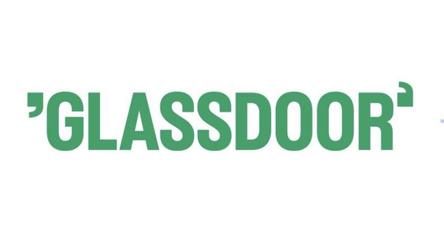
edit: wait that's Glassdoor's actual new logo?!

@lichendust yes!! i couldn't believe it either.
@lichendust @palomakop It's deliberate, but you can't really tell why unless you look at the logo without the brand name β€” like, say, in their favicon. The single quotes are rotated so that the first one is a g (for glass) and the second one is a d (for don't get too clever with your typography).
@lichendust @palomakop As an explication for one of the worst logo-change choices I've ever seen: https://logos-world.net/glassdoor-logo/ - it's deliberate, and sill awful.
Glassdoor Logo, symbol, meaning, history, PNG, brand

The Glassdoor logo stands for honesty and transparency at the dating stage; then, cooperation will lead to mutual growth and development.

@palomakop *twitches* I think that needs a CW!  

I've noticed that things that are obviously wrong get more attention, so I think this is trolling folk for clout.