Obsessed with this quote from an AI bro who is under the impression that horses "can do whatever they want now" as a result of the invention of the car.

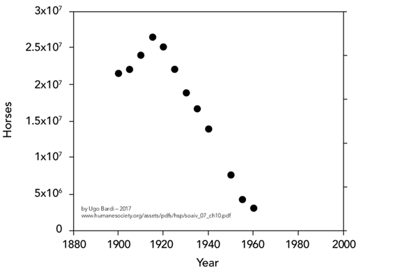
@kentenmakto @henry I think it's linear, and even zero-based, but it sure looks like some weird log thing doesn't it.
Edit: On the left side. On the right, no idea.
@jef @henry Damn me, it *is* linear. It's just a) seeing exponential notation in that context is weird and b) when you're graphing growth and, uh, ungrowth, you just expect a semi-log graph.
("Three data points will almost always form a straight line on either a linear, semi-log, or log-log graph. So if you only have one kind of graph paper, you should only take two measurements.")
@kentenmakto @jef @henry there’s some real chartcrime going on at the bottom of the y-axis scale. I assume it’s just interrupted from zero, but it means the last few datapoints are not clear.
So around 5x reduction on number of horses from peak? That’s actually far less than I’d guess.