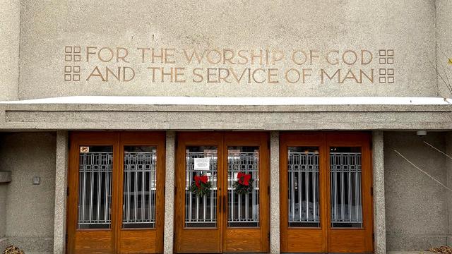
This might be the most obsessively nerdy thing I've ever seen. One of the bronze ‘H’es in a sign was installed upside down, and the author dove into historical research to find out when and why.

https://www.inconspicuous.info/p/h-bomb-a-frank-lloyd-wright-typographic

H-Bomb: A Frank Lloyd Wright Typographic Mystery

The famed architect made a surprising error on one of his most notable buildings — or did he? A deep dive to uncover the truth.

Inconspicuous Consumption

I just remembered that I have ALSO blogged about erroneous sign typography. AND like this author, I pulled in Jonathan Hoefler to consult!

https://blog.plover.com/IT/typo/typographical-mysteries-of-yeadon.html

@mjd

... to be continued.

I was not expecting that.

@mjd A bit less nerdy because sports, but reading that the first thing that came to mind for me was Pablo Maurer's piece on a New York Times photoshoot of the US Mens Soccer Team in the run-up to the 2002 olympics, and how he rescued a drinking fountain for the US Soccer Hall of Fame: https://pablomaurer.com/the-story-behind-
Pablo Maurer | Award-Winning Soccer Writer & Photographer

Pablo Maurer is an award-winning sportswriter and photographer whose work focuses on the game of soccer in North America.

@BikesAndBBQ Worth it just for “I can make anything look sexy. If you ask me to take a photograph of a tomato, it’s going to end up looking like a hot tomato.”
@mjd Jesus H Christ – that's magnificent!
@mjd I kinda like when the crossbars don't align consistently. It evokes a sense the inscription has leapt into reality directly from the drawing, retaining the hand of the draughtsman. Which seems important for a religious building to convey.