UX people! I want to know your opinion. Since I can’t really pin down my feelings, I need your help judging a design.

The interface of Nextcloud always makes me a little uneasy, when I see it. Can somebody explain to me the reason might be and how to fix it?

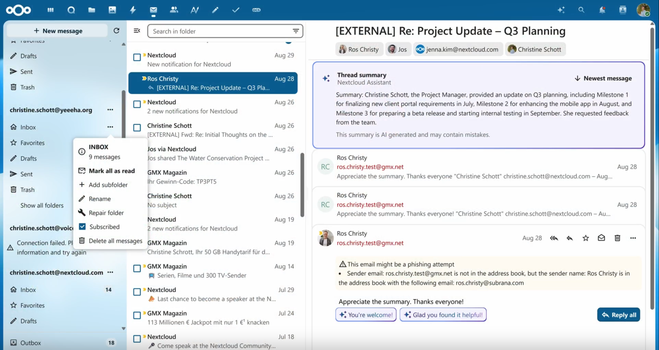
(Screenshot from the recent Nextcloud presentation)

@MoritzGlantz It's all the details. Especially spacing, icons that are strangely misaligned with the text, and the prioritisation of elements. Everything has a similar visual prioritisation, and without sufficient white space, it looks cluttered and claustrophobic.
@florianboegner Yeah, it is like there was no hierarchy whatsoever. Everything screams at me at the same volume.