Home
Explore
mastodon.social
mstdn.social
infosec.exchange
mstdn.jp
social.vivaldi.net
piaille.fr
hachyderm.io
mastodon.world
troet.cafe
m.cmx.im
mastodon.uno
mastodon.gamedev.place
social.tchncs.de
mastodon.nl
norden.social
flipboard.social
kolektiva.social
mathstodon.xyz
mastoturk.org
nrw.social
occm.cc
tech.lgbt
defcon.social
mastodonapp.uk
mstdn.ca
universeodon.com
c.im
masto.es
sueden.social
toot.community
mstdn.party
det.social
sfba.social
mastodon.scot
tkz.one
ohai.social
mastodon.sdf.org
mastodon.ie
ruhr.social
hessen.social
mastodontech.de
mastodon.nu
pouet.chapril.org
livellosegreto.it
mastodon.au
social.linux.pizza
muenchen.social
social.cologne
indieweb.social
mastodon.eus
ieji.de
mastodon.bida.im
ioc.exchange
mastodont.cat
mastodon.green
wehavecookies.social
feuerwehr.social
social.anoxinon.de
masto.nu
nerdculture.de
ruby.social
mindly.social
mastodon.ml
cyberplace.social
metalhead.club
phpc.social
uri.life
dresden.network
mastodontti.fi
m.otter.homes
toot.wales
sunny.garden
climatejustice.social
noc.social
sciences.social
privacysafe.social
mstdn.plus
freiburg.social
tooting.ch
hostux.social
furry.engineer
rollenspiel.social
blorbo.social
mastodon.me.uk
mastodon.com.pl
gaygeek.social
rivals.space
urbanists.social
bonn.social
rheinneckar.social
mast.lat
mastoart.social
wien.rocks
discuss.systems
mastodon-belgium.be
expressional.social
h4.io
ursal.zone
mstdn.games
mapstodon.space
todon.nl
masto.pt
hcommons.social
snabelen.no
glasgow.social
fairy.id
darmstadt.social
shelter.moe
sakurajima.moe
lgbtqia.space
cupoftea.social
tilde.zone
mastodon.gal
retro.pizza
urusai.social
ludosphere.fr
muenster.im
qdon.space
bookstodon.com
peoplemaking.games
mastodon.berlin
socel.net
toot.aquilenet.fr
pawb.fun
vmst.io
mast.dragon-fly.club
veganism.social
kanoa.de
union.place
mstdn.dk
witter.cz
bark.lgbt
toad.social
theblower.au
mastodon.uy
oslo.town
eupolicy.social
machteburch.social
tooot.im
xarxa.cloud
masto.nyc
musicworld.social
freeradical.zone
gardenstate.social
fandom.ink
stranger.social
burningboard.net
famichiki.jp
disabled.social
thecanadian.social
mstdn.business
cultur.social
graphics.social
mountains.social
pnw.zone
furries.club
tea.codes
hear-me.social
mustard.blog
mastorol.es
mastodon.pnpde.social
musician.social
toot.kif.rocks
bahn.social
dizl.de
fedi.at
ani.work
libretooth.gr
babka.social
ciberlandia.pt
musicians.today
archaeo.social
dmv.community
vkl.world
tyrol.social
mastodon.energy
tuiter.rocks
frikiverse.zone
toot.re
drupal.community
masto.nobigtech.es
gamepad.club
social.seattle.wa.us
lou.lt
donphan.social
mast.hpc.social
is.nota.live
fulda.social
muri.network
toot.si
tchafia.be
bzh.social
social.politicaconciencia.org
hometech.social
puntarella.party
mastodon.vlaanderen
drumstodon.net
social.silicon.moe
wargamers.social
norcal.social
lsbt.me
mograph.social
datasci.social
theatl.social
toot.funami.tech
opencoaster.net
mastodon.africa
devianze.city
epicure.social
qaf.men
hispagatos.space
burma.social
elekk.xyz
est.social
4bear.com
apobangpo.space
friendsofdesoto.social
mastodon.education
lewacki.space
mastodon.london
mastodon.pirateparty.be
kurry.social
mstdn.animexx.de
colorid.es
mastodon.cr
toot.garden
leipzig.town
esq.social
ruhrpott.social
indieauthors.social
hoosier.social
fikaverse.club
planetearth.social
mastodon.bot
fairmove.net
genealysis.social
mastodon.wien
library.love
frontrange.co
toots.nu
techtoots.com
fribygda.no
mastodon-swiss.org
opalstack.social
arvr.social
h-net.social
raphus.social
rail.chat
poweredbygay.social
rheinhessen.social
paktodon.asia
mastodon.sg
seocommunity.social
cwb.social
bologna.one
camp.smolnet.org
episcodon.net
epsilon.social
stereodon.social
khiar.net
okla.social
growers.social
k8s.social
mastodon.cipherbliss.com
biplus.social
mastodon.free-solutions.org
elizur.me
mastodon.hosnet.fr
masto.yttrx.com
birdon.social
skastodon.com
squawk.mytransponder.com
mastodon.babb.no
mastodon.frl
23.illuminati.org
cville.online
silversword.online
balkan.fedive.rs
ailbhean.co-shaoghal.net
lounge.town
mastodon.bachgau.social
mastodon.iow.social
kzoo.to
mastodon.ph
kcmo.social
mcr.wtf
social.diva.exchange
synapse.cafe
nfld.me
mastodon.bahia.no
darticulate.com
social.ferrocarril.net
voi.social
mastodon.ee
troet.fediverse.at
polsci.social
fpl.social
nautical.social
dariox.club
nwb.social
social.sndevs.com
mikumikudance.cloud
nomanssky.social
bvb.social
ms.maritime.social
ceilidh.online
kjas.no
netsphere.one
nutmeg.social
wxw.moe
learningdisability.social
computerfairi.es
Log In
Arthur Charpentier ⏚ 🇨🇦 🇯🇵
Feb 18
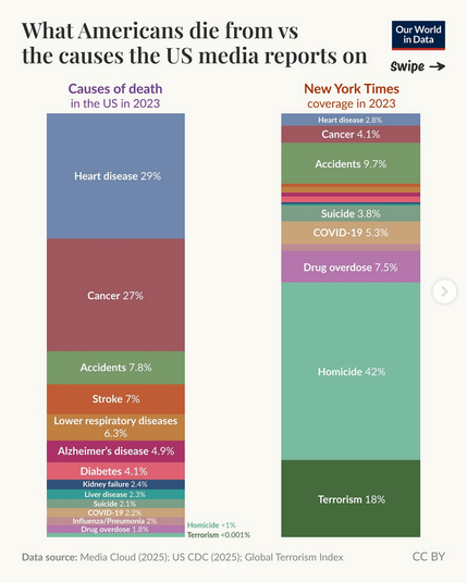
I love this kind of graph, we should do it for a lot of topics, to better understand media distortions (and not only in the US)
8
107
128
Show thread
Satin Thérèse
@freakonometrics
woa genius graphic! Lets do the same for France !
0
0
1