Details like these demonstrate just how terrible many design decisions in @LiquidGlass really are.
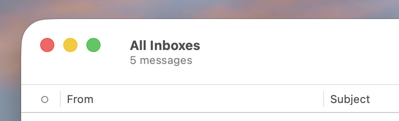
To complement Mario's screenshots below, here's what the top left corner looks like when the sidebar in Mail.app is collapsed. Like Mario writes, that toggle button is now in the overflow menu on the other side of the menu bar. https://mastodon.social/@marioguzman/116003038206224260