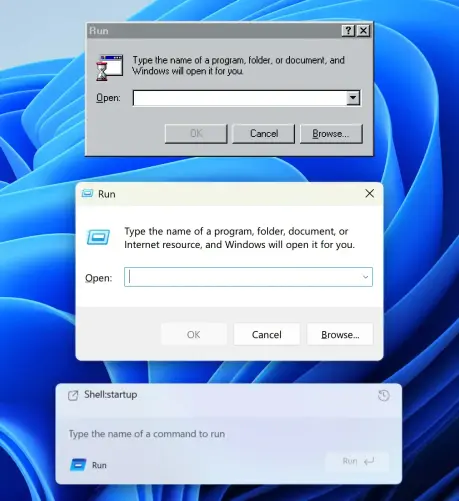
How UI degrades over time.
Top (Windows 95): great contrast, obvious shapes. Instantly readable.
Middle (Windows 11): shapes are still self-explanatory, but contrast is gone.
Bottom (Windows 11 Insiders): what am I even looking at? The only shape I can understand here is the Run button. Barely visible, though.
Then, on the left, there’s another something that says Run and has an icon. What is it? A window title? Another button? Why does it have to say Run twice?
... 1/3