I have a design issue I can't quite settle on, mostly because it doesn't massively matter, but I would like to figure it out properly. So I'm going to run a couple of polls here to find out how people feel about it.

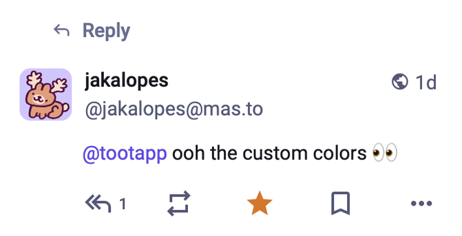
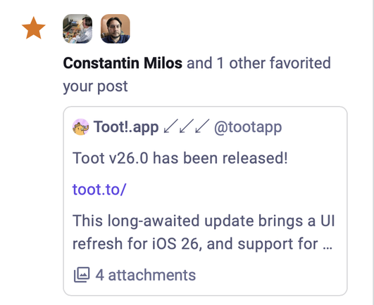
Namely, when displaying notifications, both the Mastodon web interface and Toot! have two different styles they use: Either a full post like on a normal timeline, or a sort of compact version shown embedded in the notification message.

The two are shown below:

The question is, which notifications should use which? Some are fairly obvious: Mentions should probably use the full toot, while favourites and boosts should use the compacted one, especially when you have folding enabled.

But for some it's less clear! For instance, Mastodon shows finished polls as full toots, while Toot! now uses the compact form, because I found the full posts a bit confusing when reading notifications.

But, do you agree with this?

I think polls should show the full toot.
37.7%
I think polls should show the compact version.
52.8%
I just like answering polls.
9.4%
Poll ended at .
There are other types that are also less clear. What about notifications when somebody you have subscribed to posts? This is a bit more like a mention, so it kind of makes sense to use the full view, but Toot currently uses the compact one.
I'd prefer the full one.
41.8%
The compact view makes sense.
41.8%
No thoughts, only clicks.
16.5%
Poll ended at .
And for completeness, what about mentions? Maybe you think ALL notifications should use the compact view to be consistent?
No, that makes no sense, mentions should stay.
56.5%
Sure, it would be more consistent to use compact.
34.1%
I am taking part in the activity!
9.4%
Poll ended at .
My main argument against being consistent here is that it would make everything blend together a bit TOO much, it's good to have some visual variation to make it clearer at a glance what is going on.
@tootapp Scrolling through my notifications I think that a toot (mention, subscribed toot) should show the full one, whereas an action to a post (edit, favourite, poll finished) should show the compact version. I think that’s a clear difference, but undoubtedly someone will now reply with a case that’s unclear under this rule 😅

@h5e Yeah that does make sense as a rule, "a toot is posted" versus "a toot changed".

I just don't use subscribing so I don't know how that feels though! Maybe I need to start just to make sure this rule is good...

@tootapp i think the answer could even be less consistency, maybe each of these notification types just demands a subtly different style.
@tootapp I care more that I have to first click on notifications too see if I have any. How about a badge, please?
@tootapp From an accessibility and screen reader perspective, I like as much info in a mention or anything in the notifications tab as possible. I don't think, using Voiceover, I can click on the pol options, thus this reply.
@Lynn The amount of information should be the same between the two, it is mainly just a difference in visual representation.
@tootapp As long as Voiceover can read the information, I am happy! ☺️

@tootapp i like the full version, because then I can quickly scan someone posting about something, vs someone responding or doing something with another post (such as favving or boosting)

So full view for subscribed posts make sense

(Or if you're gonna do compact; maaaaaaybe a preference toggle to make it full? :3)