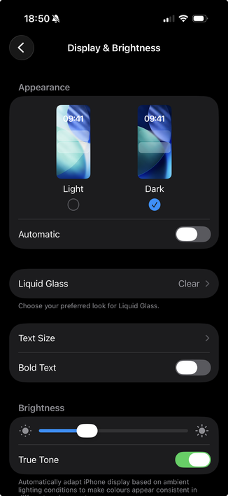
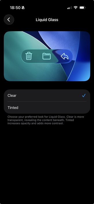
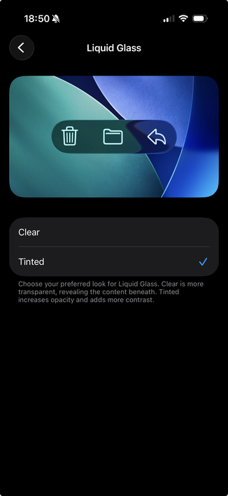
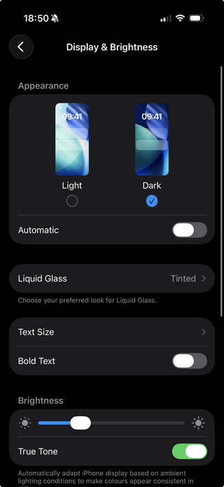
Well I like this! Instead of the sledgehammer-to-crack-a-nut workaround of turning on reduce transparency and high contrast modes, with iOS26.1 you can just 'tint' the Liquid Glass UI.
Settings → Display & Brightness → Liquid Glass → Tinted
Well I like this! Instead of the sledgehammer-to-crack-a-nut workaround of turning on reduce transparency and high contrast modes, with iOS26.1 you can just 'tint' the Liquid Glass UI.
Settings → Display & Brightness → Liquid Glass → Tinted