2024 vs 2025
Really like your stroke work except for the foliage of the tree. ¿Looks like you used some scatter spray tool? It looks a bit out of place to me (to harsh) and also the ends touching the horizon leave the square stroke visible when imo a rounded cap would look more natural.
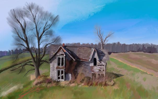
New image also greatly benefits from the wider framing to show us the surroundings with a more colorful palette 🎨 as a contrast to the house (foreground). In your palette the blue sky vs orange/yellow fields also neatly form a suave contrast, but not stark enough to steal the attention.
Thank you! And help me see what you mean about the square stroke and so on.
As for the scatter brush I used a pencil brush and lightly shaded to try and give the illusion of detail without painting every single branch. Without zooming in it feels like I did that to me but I’m also the one painting it. Still trying to figure out how to paint trees… They’re so hard.
Yeah, the illusion looks quite good from afar (eg the thumbnail for the post) but full screen I noticed that many of the strokes emulating leaves at the contours of the tree end with straight edges perpendicular to the branch rather than being more rounded or have some noise that breaks up the straight lines.
I mark up what I mean here: