There was a golden period of OS X roughly between 10.5 and 10.9.

Up to 10.4, windows were too textured: stripes, brushed metal.

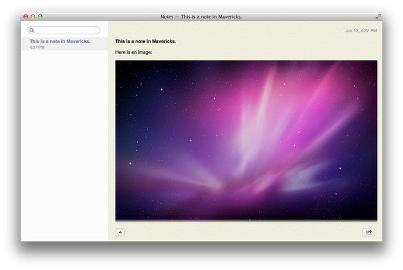
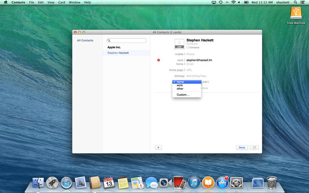
In 10.5 till 10.9 we got to enjoy the beauty of Aqua paired with calm, tasteful gray window frames and controls that had visible depth.

From 10.10 till 10.15 was okay-ish: the flat took over, but we still had contrast and shapes.

Starting from 11, everything became rounded, low contrast and lost visual cohesiveness.

10.5 till 10.9. We didn’t know how good we had it

Look at this. Just look. How icons are all different sizes. How labels lack horizontal padding. How border around “CPU” disappears. How “Search” text is not vertically centered. Look at the ugly pinkish gray background. I refuse to believe a human designed it. No human with eyes could purposefully do this. It’s not rocket science. It’s basic design hygiene.
@nikitonsky seems to me the visual style and the bugginess are two separate questions no? you can do the calmer visuals without the specific quality and contrast issues you pointed out here - and without those that last screenshot would look nicer than the in-your-face y2k aesthetic of the first ones
@tbernard technically yes, in practice they seem to correlate. If people care, they get both right. If they don’t, they mess up both
Looks like I’m not the only one who arrived at the same conclusion https://mavericksforever.com/
Mavericks Forever

@nikitonsky One could argue that they went a bit overboard with texture in Mac OS X 10.8, but even here things were clear and easy to read.

@nikitonsky They toned down the texture in Mac OS X 10.9. I'd argue that the Contacts app in particular is _more_ readable with the address-book style layout.

Screenshots courtesy of @ismh86's Aqua Screenshot Library: https://512pixels.net/projects/aqua-screenshot-library/

I'm not against the rounded look, but the thing I hate the most since the Big Sur redesign is the "unified" toolbars and title bars. The lack of button borders is easily fixed by an accessibility setting, but yeah it's not great that I have to do this, defaults should be good enough.
@nikitonsky
Your comments are so shallow, an OS is so much more than its authentic look.
@nikitonsky 100% agree.
The iOS influence is bigger every day and this is slowly killing the quality (UI side) of MacOS.
Shallow? If you struggle to understand the purpose of a UI component this brings an additional mental charge. And this matters. This disease also touched Windows which I had to use at work. This low contrast and absence of clear recognition of each UI component coupled with virtual machines was a nightmare.
@nikitonsky bring back snow leopard?
@jamesdoc @nikitonsky yes please it had the sweet spot. The funtionalities were simple lean and not to bloated. All options were reduced to a minimum. And now. Not mentioning the design that @nikitonsky allready mentioned. Osx became bloatware. And that makes me think is this once again the indicator of long living tech. That it become bloated and buggy and not coherent?
@nikitonsky Slightly offtopic but I'd love to experience in an altered history where system-wide dark mode feature came like 10.5 or 10.6 early.

@nikitonsky @me_ I prefer the 10.10 era to 10.5, but I think that’s just an aesthetic preference. Both seem “correct” on actual functional grounds.

So much went wrong in 11. My personal “canary in the coal mine” about the UI now being done by people who didn’t understand what made the Mac good, was hiding the proxy icon.

I’ve been hearing about “the last good version” since at least 2011, and never jumped on that train, but this sure feels different.

@nikitonsky

Yes I also miss the Win7/KDE Oxygen look when done right. Translucent, complex icons, just looks cool!

Not always usable, but themes that are black/white and flat-everywhere is for sure not the best we can do. Simply very easy to do and be consistent

@nikitonsky @bugaevc Just wanted to post I detected how good liquid glass actually is! I booted my 2005 PowerMac G5 and it showed some kind of magic awesome liquid glass called „Aqua“. Amazing that it runs on machine that old, isn‘t it?

@nikitonsky I will admit that it’s just a feeling and I have no actual data to put behind this, but it really feels to me like over the last few years Apple has really taken their eye off the ball and doesn’t know what to do with the Mac anymore.

They can’t kill it because it’s their only supported development platform for their actual cash cow, but it’s clear at least to me that the kind of bold design vision we used to expect and appreciate has left the building.

and then there are also the other signs like the increasing level of difficulty people are experiencing almost across the board, trying to hook their Macs up to any devices except the most recent and most expensive Apple displays.

@nikitonsky These all look like available theme options among the many Linux desktop environments. Ymmv
@nikitonsky Yes, because everything that was great about Apple was a result of the leadership of Steve Jobs, and once he died, Tim Cook took the company in a very different direction. Everything Apple is now a pile of shit. The last iPhone Jobs was in charge of was the iPhone 5, released in 2012. Once the pipeline emptied, by late 2013, everything Apple was under the control of Tim Cook.
@nikitonsky I know what I like and I like my scrollbars to look edible. Seriously, though, definition in UI design needs to come back.