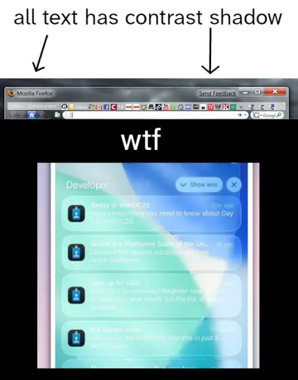
liquid glass isn't bad because ew ew new ui no likey ew it's bad because of this:
@tauon they fixed this (badly, they just dim your background)
@silly @tauon NO WHYYYY
@[email protected] @tauon only when you scroll down to see the notifications, probably should have mentioned that
@tauon drop shadows need to return

-carrie

@tauon

In 2028, liquid glass was followed by "Liquid Milk", everything white on white, following the then-popular design mantra of "the ear is the new eye".

@tauon yeah i actually like some of the new design features, but it has so many obvious usability fails
@tauon exactly why i hate liquid glass, its an accessibility nightmare, things become unreadable and buttons blend into the background and become hard to find because they have too much transparency (windows aero never had this problem)
@ElliesSurviving @tauon fwiw it's supposed to have a shadow in scenarios where it might be too bright in the background
@tauon Skeumorphism, when done right in Apple's macOS Aqua, Microsoft's Windows Vista & 7 Aero, and KDE's Oxygen, still beat flat design and ESPECIALLY whatever the hell that Liquid Glass garbage is... 🤢🤮
@tauon the text doesn't look like that on my phone though... the contrast isn't that bad imo but if it is bad for your eyes there is an option to darken the backgrounds without just turning on the "increase contrast" accessibility
@tauon when you glass the flat but not gloss the glass so it ends up flat

@tauon Funny, because the old Aero firefox also has some hard-to-read text: "Menu" and "Marque pages".

But yes, text contrast is important and apple fscked up. It seems like they released something in a very unfinished state. And now they're rushing mediocre fixes out the door.

Glad I'm not using any of their stuff as a daily driver.

@tauon Having a relatively light background, I was instantly hit by every possible variant of this. I can not understand how an obviously common issue like this was not addressed when it's been brought up since the betas.
@tauon the funny thing is before liquid glass, apple people dunked on Windows Aero for "hurr durr not legible enough" (ignoring the contrast shadow behind all text in the titlebar)
@tauon remember when old phones would usually come with a couple themes you could pick from?...
@tauon They are just a multi-billion dollar start-up company don't be so harsh to them!

(They deserve all the hate)

@tauon

More like liquid ass!

@tauon

Remeniscent of their light grey text on slightly lighter grey (or white) background information on their charger bricks that have only gotten worse over time.