The Entire History of the World—Really, All of It—Distilled Into a Single Gorgeous Chart
In 1931, John B. Sparks created the Histomap, condensing more than 4,000 years of world history into a vibrant infographic.
By Rebecca Onion (from the archives)
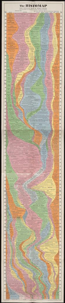
The Entire History of the World—Really, All of It—Distilled Into a Single Gorgeous Chart
In 1931, John B. Sparks created the Histomap, condensing more than 4,000 years of world history into a vibrant infographic.
By Rebecca Onion (from the archives)