Now this is Mac OS X
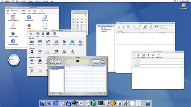
If Mac OS X's Aqua debuted today we would be praising its bold, beautiful iconography, clear, readable UI, and accessible, friendly design language, and think it a dramatic move away from transparency, rounded corners, and spurious visual effects and towards a more traditional, nuanced, professional style
@stroughtonsmith I think the missing icon shapes are throwing people… era that’s been slowly ending for like 10 years.
the aqua icons were the thing that stood out most about Mac OS X