 Patrick Brosset
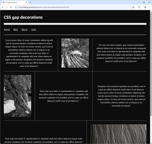
The ability to style grid and flex gaps is coming fast in a browser near you!
Bubbling with ideas for what this will be useful for!
Code: https://github.com/MicrosoftEdge/Demos/tree/main/css-gap-decorations
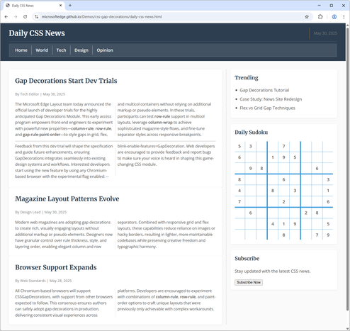
The ability to style grid and flex gaps is coming fast in a browser near you!
Bubbling with ideas for what this will be useful for!
Code: https://github.com/MicrosoftEdge/Demos/tree/main/css-gap-decorations
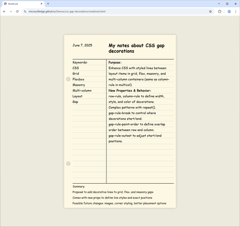
@patrickbrosset Where is the best place to give feedback for early features like this? Combining it with flex-wrap: balance; seems slightly buggy.
There is one old, yet unsolved, CSS problem: shrinking containers to fit the content when it automatically wraps. While not intentional, anchor positioning allows us to come closer to solving it, at least for a few cases. In this article, I’ll demonstrate how we can use anchor positioning to neatly decorate wrapping text or elements in flex or grid contexts.
 Olliew
 Roma Komarov