Lord have mercy, we have new cursors on macOS.
Also interesting that the new wallpaper is called "macOS Beta" rather than the OS name. Not sure they've done this before during a beta period.
Finder default icons are also sapped of contrast and color. This may grow on me, but I'm definitely seeing some design choices here I don't love off the bat.
@matt Can we change the sidebar icons?
@matt and here I was hoping this was the year that icons in the iOS share sheet would finally gain color so I could finally tell them apart quickly
@matt They look like a file transfer failed and those are just the placeholders.
@matt are they still made of paper or are they glass now?
@matt .Finder buttons { padding: 1em; }
Fixed!
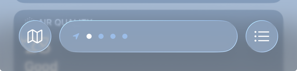
@countablenewt @matt Ignoring the inconsistent radii and padding (and it’s incredibly hard to ignore either), is that a pagination UI in a search field?