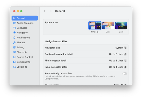
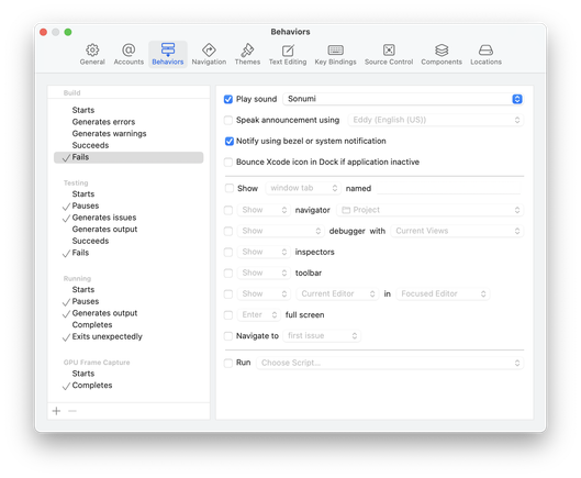
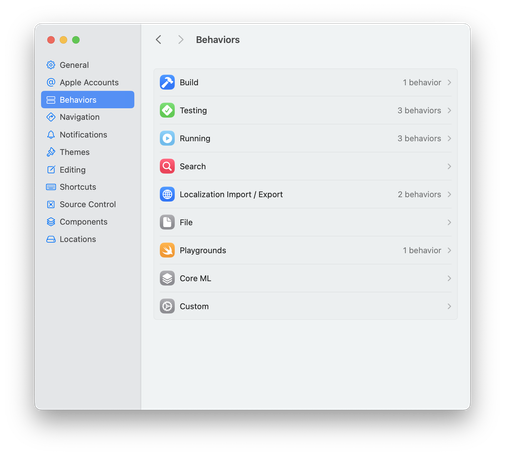
@dgi I'm not a designer but I'll tell you what I think: information density has been dramatically reduced. Settings have been paginated in a way that is more modal and makes for more literal work to accomplish the same task. As an aside, the website linked in your profile is 'not found'
@dgi @krzyzanowskim I’d say two things bad about it:
• too much distance between labels and controls, because they’re aligned to opposite ends
• this really needs a third layer in the middle of the window. You keep going back and forth because the sidebar doesn’t adequately reveal the navigational hierarchy
@dgi The biggest thing to me is about how you see a whole: before you could see all the configuration of a given trigger at a glance, and now you need to repeatedly navigate to explore it.
So that means it’s much harder to keep in your head (you need to build the mental model yourself during navigation, instead of having one presented to you, in one go) and means it’s a lot slower, since you need to click around a lot more.
Separating can be could to avoid info overload, but can be too much!
@krzyzanowskim When I try a new Mac app, one of the first things I do is check out the Settings window. I check whether it implements a standard Settings window, and whether it animates the resize when switching panes. I find that to be a good indicator of whether the app feels like a good Mac app.
I agree that the new style looks awful. Apple has apparently ignored the complaints about System Settings on Mac.


