Maybe you’ve heard: every font is free! Since fonts aren’t subject to copyright, you can legally ‘pirate’ them if you use a specific loophole!

...except that’s not really true. I’ve seen this claim repeated quite a lot recently, and it’s missing some pretty important nuance.

A thread 🧵
Firstly, a quick disclaimer: I run a type foundry. I’m not a legal expert (and this is not legal advice), but I do have a fair bit of experience in this area — my job is to design typefaces, make fonts, and sell licensing.

Those are three separate things. Let’s start by talking about that.

Most of the time, we use the words ‘font’ and ‘typeface’ interchangeably, and we generally talk about ‘buying a font’ rather than ‘buying a font license’. Most of the time, that’s fine! But if we’re talking about fonts and copyright, those terms actually have very different meanings.
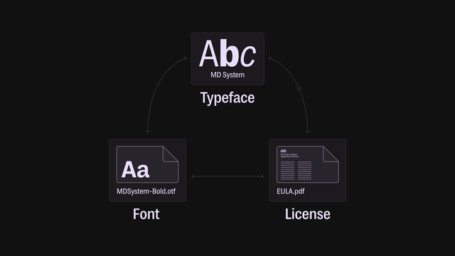
Here’s how they fit together, in the simplest terms: a typeface is what you see, a font is what you use, and a license is what you pay for.

A typeface is a specific design for a set of letters, numbers, symbols, and so on.

Often, that design includes variations, like bold and italics, different widths, or even wholly different styles. If these styles all share a name, they’re one typeface.

@mass_driver Since you’re getting into nitty-gritty terminology:
I believe the practice of using “typeface” to refer to a whole family is a vestige of faulty logic that spread in the early digital era (perhaps related to some erroneous terminology recommended by Apple at the time).

When I’m trying to be precise with my wording, I reserve the use of “typeface” to refer to the design of a single variant, and use “typeface family” when referring to the larger group of related design variants.

@nicksherman I’m conflicted on this, since while I agree it’s a post-digital usage of the term (and probably started out as a mistake), there’s an ever-increasing grey area around what exactly defines a family/subfamily/etc.

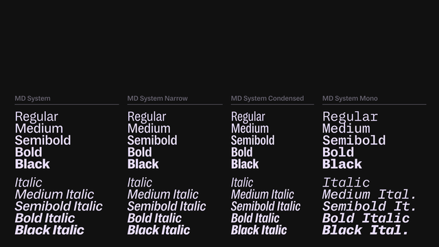
To use the example above, MD System collectively is a typeface family of 40 static instances. But internally, it’s two VFs (mono & prop.), one of which is divided into groups for ease of use. Is each instance a typeface, each axis combination, each group, each VF?

@mass_driver When I’m trying to be precise, I treat it as one typeface being one instance – regardless of if it’s delivered via a static font or variable font – and the other things are families, subfamilies, series, postures, weights, widths, axes, etc.
@nicksherman @mass_driver Gotta say I use “typeface” for everything. Minion is a typeface. Helvetica is a typeface.
@slye @nicksherman @mass_driver Are all Helveticas one typeface named Helvetica?

@Okay @nicksherman @mass_driver Funny – but kinda yes? It definitely gets hairy when a design morphs into loosely-related styles, like Helvetica or Gill Sans.

In my mind, “typeface” is the word that represents the distinctive thing you made; the thing a designer chooses. “What typeface are we going to use for this ad campaign?” “What’s the typeface on that movie poster?” I don’t feel the need to say “typeface family” in cases like that.

@slye @Okay @mass_driver Yeah like I said before I don’t think there’s usually a problem when using “typeface” as shorthand for what is a typeface family in casual discussion. But in situations where those distinctions may be more consequential, or there is just a desire to be more accurate, it’s useful to have the differentiation. Otherwise, if Helvetica (the family) and Helvetica Bold Italic (the family member) are both considered a “typeface”, it creates ambiguity and potential for confusion.

@nicksherman @Okay @mass_driver Well you did refer to it as a “vestige of faulty logic.” 🙂

I would agree with what I think you just said, which is that “typeface” works fine unless the occasion calls for greater precision. I would only say that, for me, saying “typeface” almost always suffices for “typeface family” (which I almost never say).

Well, in a licensing context I would certainly clarify “Do you need the whole family?” or something like that.

@nicksherman @Okay @mass_driver Oh and to your last point: Yes, although I would never refer to “Helvetica Bold Italic” as a typeface. To me, that’s a style. Sometimes a font. It’s the file you download or install, or the style you select from a font menu.
@mass_driver @nicksherman @Okay @slye Indeed! If I see a brochure set in Palatino with its bold and italic, I just say “it’s set in Palatino!”
@Okay @mass_driver @nicksherman @slye On the other hand, in the old days, an upright and an italic were definitely treated as a single typeface. For me today, though, the number of typefaces Goudy said he designed feels inflated, because we fold extensions—at least colloquially—into one typeface [family].
@typeoff @Okay @mass_driver @slye That is a good example of a situation where being explicitly clear by saying “typeface families” instead of “typefaces” is useful.

@nicksherman @typeoff @Okay @mass_driver @slye

I use typeface when I give up. It’s a marketing term, an indicator of direction not of distance.

Otherwise, more or less successfully, we stick to: collection/type system > (type) family > subfamily > variant > styles/fonts/instances.

See also:
https://mastodon.design/@rosetta/114635505265415923

Rosetta Type/Research (@rosetta@mastodon.design)

Here is an opinion: if typeface is what we see, can we really design it? Our grasp of human perception is so limited that to think we have a firm control over how typefaces are seen is a misapprehension. It seems to me that we are designing fonts in fact. And this whole discussion over “it’s not a font, it’s a typeface” proliferating across all undergraduate courses is just a form of type-geek signalling.

mastodon.design

@rosetta @nicksherman @typeoff @Okay @mass_driver @slye

Like Dan, I would say “this is Palatino”. In a way, is the Typeface the Brand? Like the name that would represent the idea and the rest sits “within it” (conceptually, if that makes sense)

@typeoff @mass_driver @Okay @slye As would I! But if you asked me which of these two statements is more accurate:
A) “Palatino with its bold and italic are a typeface.”
B) “Palatino with its bold and italic are a typeface family.”

… I would say B. (Though in most normal situations A is perfectly acceptable too.)

But if you asked me if Palatino Italic was a typeface on its own I would say absolutely yes.

@nicksherman @typeoff @mass_driver @slye I think I’m thinking broader. In my head there is a gradient of classifications between generic categories like “sans serif” and specific font styles like “Helvetica Mega Demi Medium Italic”. Some of them are fuzzy but in various contexts it changes from general buckets (sans or helvetica) to specific things (A “Helvetica” proper or Helvetica Mega Demi Medium Italic dot otf).
@slye @mass_driver @Okay @nicksherman I generally agree! But there are edge cases where I don’t. In the PostScript version of Helvetica, for instances, all the italics were just unedited obliques. Those aren’t typefaces, at least not like Palatino Italic is a typeface.
@typeoff @slye @mass_driver @nicksherman because they’re poorly made they’re excluded?
@Okay @typeoff @slye @mass_driver My thinking is based much more in practical qualifiers, maybe because I still think about the “face” part of “typeface” historically referring to the marking surface of the type.
@nicksherman @typeoff @slye @mass_driver A good reminder that “typeface” is a weird word and not a particularly old term.

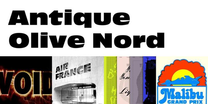
@Okay @typeoff @slye @mass_driver We talked a lot about this stuff for the @FontsInUse database. It’s tricky because we have entries for everything from single members of a family (e.g. https://fontsinuse.com/typefaces/8382/antique-olive-nord) and format-specific incarnations (e.g. https://fontsinuse.com/typefaces/238093/univers-selectric) to broad, generic prototypes (e.g. https://fontsinuse.com/typefaces/236/caslon).

Because they all use the same structure, we settled on using the term “type entity” for all those things in the database (at least for our internal discussions).

Antique Olive Nord in use

While it is now considered a member of the Antique Olive family, this ultra bold extended style was released simply as Nord in 1959–60, about two years before Antique Olive. Adopted by Letraset in 1978. [1978 ad] See also the narrower Antique Olive Compact.

Fonts In Use
@nicksherman @mass_driver @slye @Okay More so because I would t even say they were “made.” So yes. But in newer versions they are probably edited and this is moot then, I guess.