Is this possible to do with CSS?

#css #webdev

cc @kizu if you have a second
@flpvsk Looks like a responsive grid, where paragraphs always go into the first column, and the image in second, but at some breakpoint it goes into one column mode, with the image spanning multiple rows (might not work well with block gaps, but otherwise should be ok): https://codepen.io/kizu/pen/xbGEEXJ
Responsive grid

...

@kizu that looks great, thank you! In a scenario where there's a random combination of images and paragraphs, could I get rid of the explicit `grid-row-end: span 10` and make it span as many rows as the image height is?

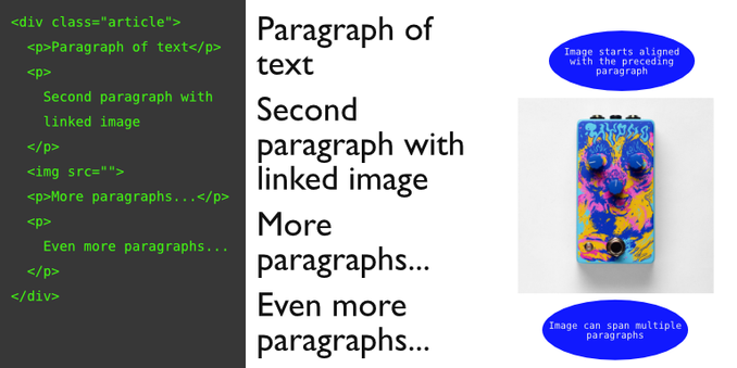
Here's an example where `span 10` places an image further than it should.

https://codepen.io/filipovsky/pen/GgJjNgq

Responsive grid

...

@flpvsk Yeah, ideally, if it is possible to calculate, this number should be not bigger than the number of paragraphs it should span. I am doing something similar on my website, but I put the number manually for every sidenote :)
@kizu I see, manual it is! Thank you 🙂‍↕️
@flpvsk I think you could also do this with `float` and `clear`, but then you'll need to have a manual margin equal to the image's width for the paragraphs :D I remember that floats could do a bunch of stuff like that a bit better sometimes.

@kizu yeah, tradeoffs.. because of manual margins, floats are harder to integrate into a larger grid of the site

I'm currently using `grid-template-columns: subgrid` for cases when I want to align the contents of the article with other things around it.