Today’s bane of my existence.

@iorsh I still use the MS Math Editor. It is far from ideal, and parts are clunky, but it gives decent visual feedback for constants and some other data. Cut-in kerning is a pain in all tools because of lack of visual feedback. The best I have come up with is edit -> load font in Overleaf -> compille TeX doc -> review -> repeat.
The MATH plugin that @khaled made for Glyphs looks pretty good. The actual cut-in editing is faster than in the MS tool, but still no realtime visual feedback.
@khaled @iorsh Do you happen to know if there are similar limitations in TeX implementations regarding growing of
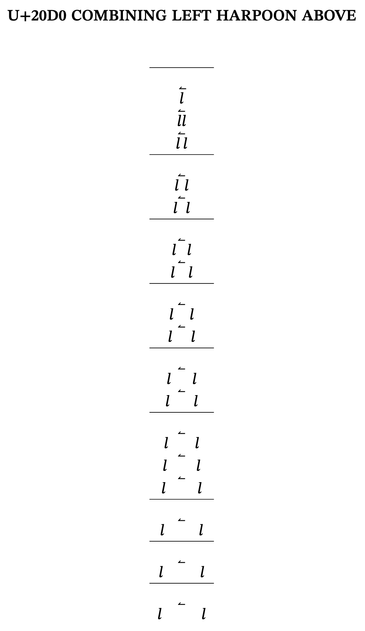
U+20D0 COMBINING LEFT HARPOON ABOVE
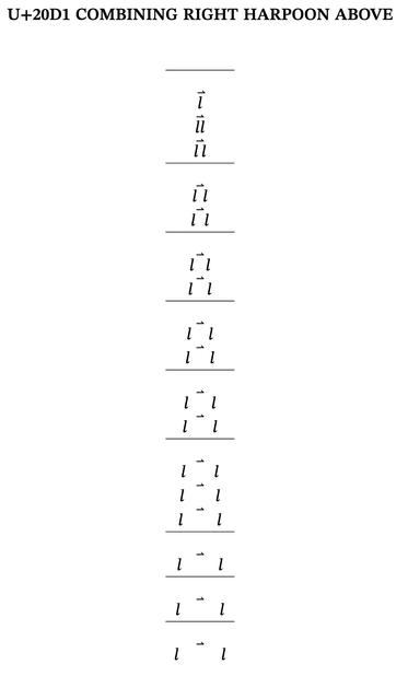
U+20D1 COMBINING RIGHT HARPOON ABOVE
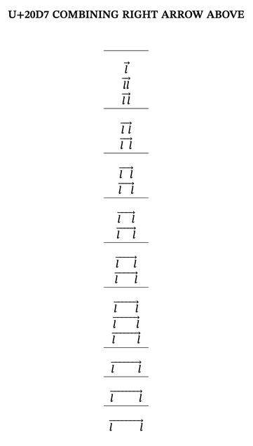
All my above and below arrows are working (including below harpoons), but these two are not. I have checked that the MATH data is the same for all these signs.