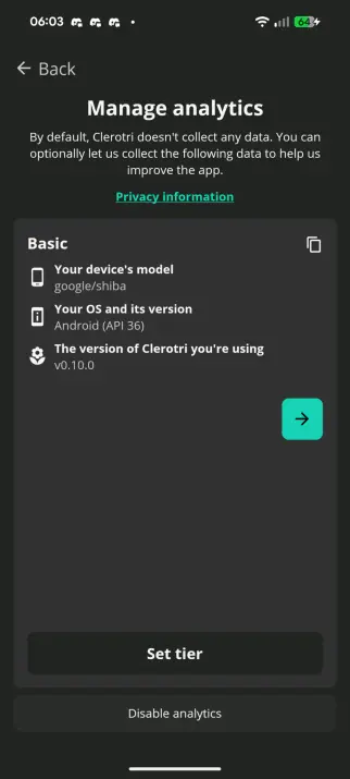
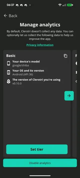
is this clear enough for an analytics settings menu? are any of the buttons unclear in their function? is it clear how to see an example of the data sent?

#boostswelcome #analytics #clerotri #ui #question
@rexo I think making the card smaller as to show the next/previous option could be neat
I also think the confirm and "disable analytics" buttons should be painted in the accent colors and the arrow removed, opting for the user to just swipe between them - which would be hinted at by my initial suggestion
@inderix hmmm...
@inderix I'm still somewhat tempted to keep the buttons to make it quicker/clearer that you can go across but yeah

@rexo @inderix i do like keeping the button, even if just as a hint indicator. does it get in the way of the text after scrolling though?

also, i think "set tier" isnt nearly as clear as something like "enable basic analytics" would be

@inderix @stringlapse the button doesn't hit the text on my Pixel 8, but that... might be an issue on smaller screens, good point

and I didn't even realise because the wording was clear enough To Me, but yeah that's much clearer
@inderix @stringlapse this is where I've landed so far. I wanted to make the disable button a bit more obvious though I'm worried about making it seem dangerous so I'm not 100% on the colour
@rexo @inderix yeah im not a huge fan of the red. i think making it the same green is okay