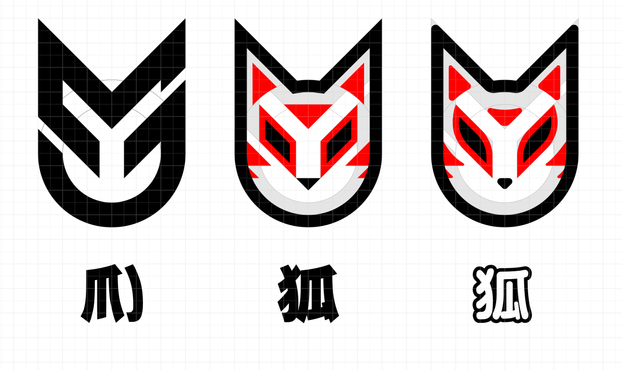
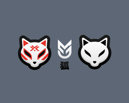
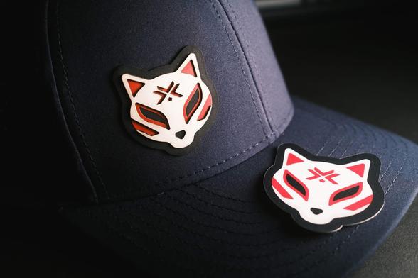
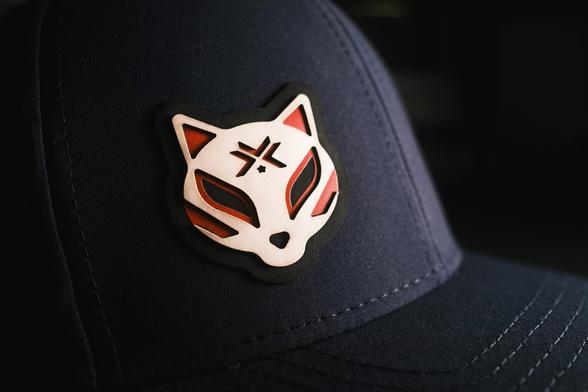
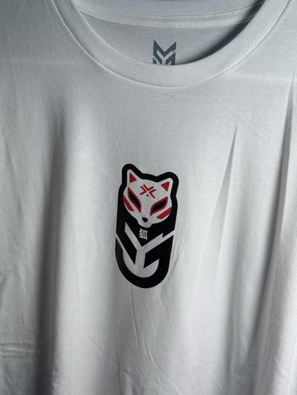
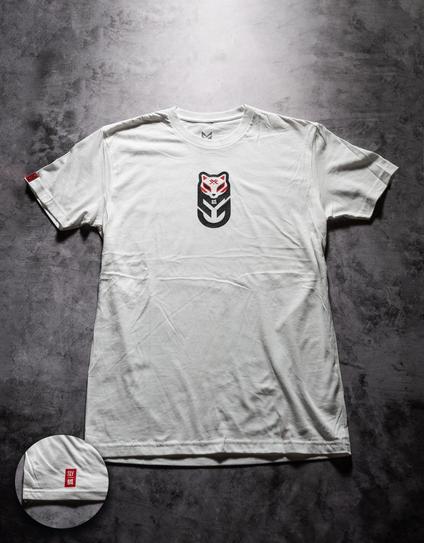
I've always loved Kitsune masks and the other day I realized my logo has the basic architecture of one. So this weekend I tried to turn my logo into one. Still needs work, but I think I'm on to something! Would be cool to have a nice kitsune version of my logo and then a mascot/character as well.

I also realized the kanji for Kitsune kind of has the shapes of an M and J too! 😅

#design

The fox structured around my logo ended up not cutting it for me. I liked the concept, but execution just wasn't there and I just couldn't get it to look good enough. It was a fun exercise though and led me to end up here. Not sure what I will do with these, but there's definitely room for more exploration and still want to attempt to make an illustrative mascot.

#design

Screen printed another shirt design over the weekend. Until now I've been only using water-based inks which I love the look and feel of, but tried plastisol for the richer colors. Also working with 2-3 colors this time (depending on the shirt color). Happy with how this one came out.

#design

Still not sure how I plan to shoot my shirts for the store photos. This one was just quickly thrown together with a single light just to see if I want to lay them flat on the ground (I'll attempt to remove most of the wrinkles when I take final photos.)

#design

@mark Even with an iron and Photoshop, the wrinkles are super hard to get out. Let me know if you figure out a good way of doing that!
@thecriterion I don't expect perfection, otherwise I'd probably try and render the shirts in 3d with textures. That's probably the way to go honestly. 😅
@mark You’re probably right! I’ve resorted to using the shirt vendor’s photos and dropping the design on them. Otherwise it looks like super amateur-hour