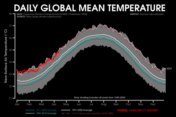
Global temperatures are once again near record highs over the last few days.

Graphic updated in near real-time at https://zacklabe.com/climate-change-indicators/

Climate change indicators

All data are referenced at My visualizations: Arctic Climate Seasonality and Variability Arctic Sea Ice Extent and Concentration Arctic Sea Ice Volume and Thickness Arctic Temperatures Antarctic Se…

Zachary Labe
@ZLabe
It's unbeliveable that whereas in all the charts you present here the global warming is clearly visible, all politicians still announce they have no clear proof of it...
#thankyou #globalwarming

@ZLabe I’ve always sensed a risk in the Paris goal of maintaining temperatures well under +2C and ideally below 1.5 as they met the world of politics and commerce, with their inbuilt inertia and tendency to pervert / misrepresent scientific fact

Sadly, it feels like 2C has the air increasingly of a target for which we’re aiming and your graphic shows us getting terrifyingly close

@ZLabe Just wanted to say thanks for the work and great visualization in general. I was wondering why the 1.5C levels are not displayed in this graph as well, doesn't it make sense any more? Wouldn't it be helpful to point out that the level set 10 years ago for 2100 is now completely breached?
@tibersept Good question - I actually full intended to only show the 1.5°C line, but I didn't find it that useful given the extent of warmth in recent years (see attached). But you're right that it could be used to communicate this exact point.
@ZLabe Thank you, again! Yes, I think this graph shows much better how inept we are. Will try looking into the data, should provide good estimates on how fast we are headed for the 2C breach.
@ZLabe When these "1000 year" events are 6mos. apart, it will have been 45 years too late to have done anything about it. Chuck you gas burning car now, convert it to ethanol or electric or hydrogen now. Tell your coop you either want solar or wind now. Your children and grandchildrens livelihoods depend on it.