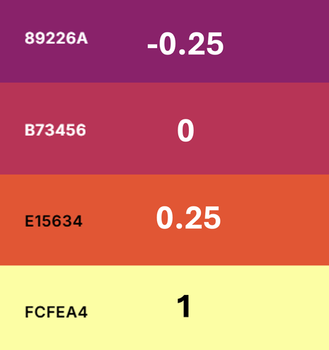
Really struggling with this palette used on a heatmap that I received externally. To me the differentiation and perceived direction of the colours from -0.25 to 0.25 is not clear at all, and if there is going to be positive and negative values, the zero point should be defined more.
#rstats #dataviz

@lwpembleton The palette is a sequential palette (low-to-high). If it is only important to show the magnitude of the numeric values, then it works really well.

The luminance increases from dark to light approx linearly with the numeric values.

Left: Hue-Chroma-Luminance spectrum. Right: Values vs. luminance. Replication code with #rstats #colorspace in alt text.

However, if the sign of the numeric values matters, then a diverging palette should be used, e.g., hcl.colors(..., "Purple-Green")

@zeileis @lwpembleton the luminance is sequential, the chroma is pretty bad in my opinion. Thats why I believe the scale looks much better in gray-scale.