I'm starting a new thread for Enceladus as seen by Voyager. The Cassini images of Enceladus are so spectacular that it's hard to emember how little Voyager showed us, and yet it seemed incredible at the time. A tiny moon with a young and complex surface. The famous plumes were not recognized in Voyager images (though just visible with hindsight and ingenious processing by Ted Stryk). Here are the images: top row by Voyager 1, the rest by Voyager 2.
#Saturn #Voyager #Enceladus
Here is a good view of Enceladus from Voyager 2. We expect craters on our moons, but something here has erased them from many areas, and apparently truncated some in the central area. Ridges, fractures, what look like horizontal and vertical movements of blocks of the crust, oddly shaped craters, and all this on what should be a frozen relic of the distant past. It's a cool place... let's map it. #Saturn #Voyager #Enceladus

Let's have a look at those Voyager 1 images of Enceladus - the 3 best ones. They all show dark patches and light whisps, a first look at the 'tiger stripe' region at the south pole. Nothing in these images hints at what is going on there, but it is intriguing. Voyager 2 didn't see this area so we had to wait for Cassini to really get to know it.

#Saturn #Voyager #Enceladus

Superimposing a grid on the image gives us the means to reproject it into a map geometry, as described earlier. The grid has 10 degree spacing. Each grid intersection is moved to fit on the appropriate intersection of a rectangular grid (the simple cylindrical projection (i.e. the grid intersections are tie points) #Saturn #Voyager #Enceladus
And here is a simple cylindrical projection mosaic of the full Voyager 1 imaging set for Enceladus. For a few months, until Voyager 2 arrived, this was the extent of our knowledge of this weird moon. But actually there never was a map like this at the time. There wasn't much point doing the work when better pictures would be on Earth soon. So this map just got made for historical interest. Pretty much the story of my life. #Saturn #Voyager #Enceladus
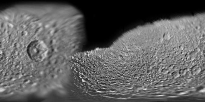
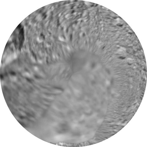
Voyager 2 saw Enceladus much closer. Here is one of the best images projected into a simple cylindrical geometry. Do this for each image and put them together, and hey presto, a map appears. This looks like it does a good job at the north pole but in practice images don't align perfectly at the edge. The finished mosaic can be turned into a polar projection and patched right at the pole for best results. #Saturn #Voyager #Enceladus
Here's another in the sequence. See the dark smudges at the left. There are some dark markings in that area in the previous image, but they don't look exactly the same. Surfaces can look dark because they have a low albedo (don't reflect much light), but also because of unresolved small shadows on a rough surface. Changes in texture can produce apparent markings where the albedo is uniform. The dark spots at the south pole in Voyager 1 images may be partly texture. #Saturn #Voyager #Enceladus
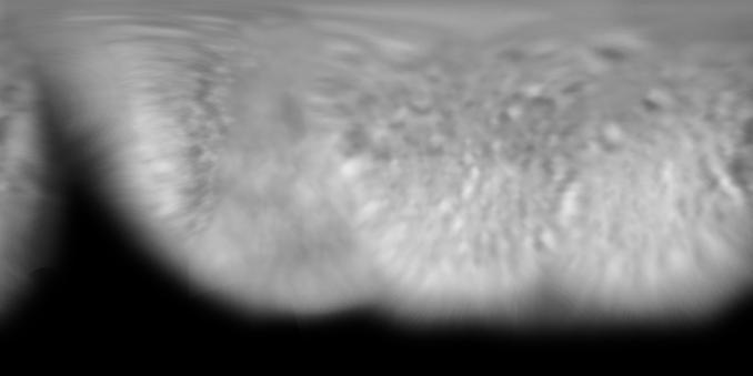
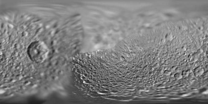
Here is the cylindrical projection map of Saturn's moon Enceladus made from Voyager 2 images. #Saturn #Voyager #enceladus
If we combine the Voyager 1 and 2 maps we add details to the southern region, though not at a resolution which is easy to interpret. #Saturn #Voyager #Enceladus
It's interesting to compare the full Voyager map in the last post with this US Geological Survey's map. My map is a photomosaic, theirs is a shaded relief drawing (made by an artist using an airbrush, not by computer rendering of a digital topographic map as most shaded relief is today. There was no adequate topographic dataset in those days, the mid-1980s). The fuzzy areas in my map show real detail but can't be interpreted topographically, hence the difference. #Saturn #Voyager #Enceladus

I think we really need both kinds of map because they are telling us different things. Incidentally, if you want to see a modern (Cassini-based) map, go here:

https://www.jpl.nasa.gov/images/pia12783-the-enceladus-atlas/

Time to be moving on... where next on our itinerary?

The Enceladus Atlas

This map sheet covers a 15-series image set covering the entire surface of Saturn's moon Enceladus. The map data was acquired by NASA's Cassini imaging experiment.

NASA Jet Propulsion Laboratory (JPL)
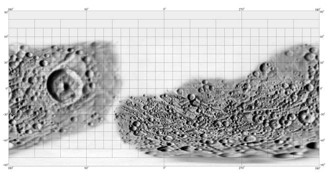
Next door to Enceladus is Mimas, the one that looks like the Death Star if you are so minded. Let's start this time with the USGS map. Like their Enceladus map, it has big blank areas, but the situation is different. I said the Enceladus shaded relief map couldn't be extended because you can't see relief in the low resolution areas. That's not the case with Mimas. Let's check the images... #Saturn #Voyager #Mimas
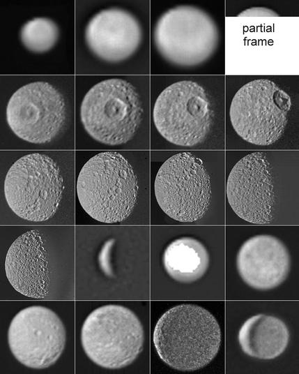
Here is the full set of MImas images. As with other indexes like this which I have made, I'm using multispectral sequences, but not for colour... I use them to make super-resolution images. What's that? The technique is now widely used (e,g astronomical image-stacking, and in planetary applications, combining multiple frames of one scene to increase effective resolution. We'll look at his process later. I was an early user of the method. #Saturn #Voyager #Mimas
A quick look at the images: Voyager 1 at the top (14 frames), Voyager 2 at the bottom (6 frames). Voyager 2 doesn't add much, but it adds something. The last 2 images show the night side illuminated (vastly exaggerated here) by light reflected off the planet and its rings, but I can't see any detail in there. The best images are of the southern hemisphere far from the biggest crater. Let's get mapping! #Saturn #Voyager #Mimas
Have I taken leave of my senses? (spoiler: not yet). This image is not Mimas, it is a building many space enthusiasts will know well, NASA's Vehicle Assembly Building (VAB) at the Kennedy Space Center. I took these 3 pictures from Port Canaveral, 12 km away, with a cheap camera, zoomed as far as it would go. We don't see much detail, but notice that they are not identical. Here they are enlarged 2x and contrast stretched. #super-resolution
The images can be registered (aligned accurately, rotated if necessary), using enlarged images so fine detail is not blurred by the rotation. They are sharpened and merged, and the result is shown here. Notice how the stripes on the flag are resolved and the extended vector in the NASA meatball logo is just about visible. Imagine doing this with 10 images, or 100. This is how backyard telescopes today take better pictures of Mars than Mt. Palomar 50 years ago. This is #super-resolution.

It's not great, but it was only 3 images. Here's a better application of it with Mars Pathfinder imagesby Tim Parker of JPL:

https://mpf.digitec.net/parker/highres-stereo.html

Now imagine taking a 6-frame multispectral sequence of a little moon and doing the same. It makes a difference. I first did this in my 1996 paper on Hyperion:

https://link.springer.com/content/pdf/10.1007/BF00118722.pdf

(I hope no sign-in is necessary for you with this link)

Mars Pathfinder

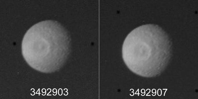
Let's look at that idea with Mimas images. It's not the greatest example - it only uses 2 images - but I did this over 20 years ago and it's not always easy to find the files. Here are two Voyager 1 images taken during approach, enlarged 5 times without resampling (i.e. nearest neighbor), letting us see the pixels. All the same features are present but not sampled exactly the same by the pixel grid. With 2 images it's not real super-resolution, more just noise reduction. #Saturn #Voyager #Mimas
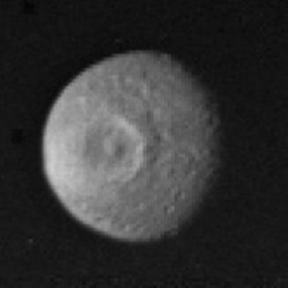
Putting those images together is a bit tricky because there's a bit of rotation between them, but here is the result. More images would give better results - I'll look out for a better example later. With pictures like these you have to do everything you can. Now we are spoiled by amazing Cassini images, but imagine some future time when a super-telescope is imaging planets around other stars. You do what you can even with poor images. #Saturn #Voyager #Mimas
Enough of the individual images, let's make a map! Here is a cylindrical projection photomosaic map made using the Voyager 1 images. Compare it with the USGS shaded relief map we started with. It extends a bit further out in some areas (e.g. north and south of the biggest crater, Herschel). If you overlay this map on the USGS map in photo-editing software, you will notice that features don't match exactly, there is some mis-registration. We'll look at this later. #Saturn #Voyager #Mimas
The same for Voyager 2. Those rather unpromising images actually do have some details to add in the northern hemisphere. Tomorrow - putting it all together. #Saturn #Voyager #Mimas

At last, here is the composite map using Voyager 1 and 2 images of little Mimas. Most of the surface is covered. You might like to compare it with this Cassini map:

https://www.jpl.nasa.gov/images/pia17214-mimas-global-map-june-2017/

I pointed out that my map and the USGS map don't agree in crater positions in places. Neither of them match this very well. Pointing uncertainties, an incorrect shape model of Mimas in early mapping (not really a sphere) and other errors affect both of them. #Saturn #Voyager #Mimas

Mimas Global Map - June 2017

This global map of Saturn's moon Mimas was created using images taken during NASA's Cassini spacecraft flybys. The moon's large, distinguishing crater, Herschel, is seen on the map at left.

NASA Jet Propulsion Laboratory (JPL)

Here is the northern hemisphere of Mimas in that full Voyager mosaic.

These maps are never going to look great compared with Cassini imaging. My intention here is to show how some details not noticed at the time were indeed present in Voyager images. We will see some more of these in the coming days. #maps #Saturn #Voyager #Mimas

Moving on to Dione - I didn't make a map but here is a US Geological Survey airbrushed map made using Voyager images. I loath this map projection but 40 years ago it was very fashionable because it made it easy to compress digital files, back when it mattered how big a file was. The distortions along the diagonal sides are horrible. But it shows image coverage. The poles are missing. That bit of the equator not shown is not really missing, as we will see. #maps #Saturn #Voyager #Dione
This is the full set of useful images of Dione (by useful I mean useful for geology, not distant navigation images or very narrow crescents). The top set of 13 images are Voyager 1, the last 5 are Voyager 2. It's a beautiful world with craters, fractures and bright streaks. One image does not have a typical dark background - it was imaged against Saturn itself. #Saturn #Voyager #Dione

Those images of Dione are hiding something. Here is one of the distant images enlarged to show an oblique view of a 300 km diameter circular impact basin. It's now called Evander. Here is a Cassini map with names:

https://asc-planetarynames-data.s3.us-west-2.amazonaws.com/dione_comp.pdf

And here is my 2002 LPSC abstract on its discovery:

https://www.lpi.usra.edu/meetings/lpsc2002/pdf/1553.pdf

I presented this but never wrote it up, being bogged down in much bigger projects at the time (and ever since).

#maps #Saturn #Voyager #Dione

Evander is located in the unmapped southern section of Dione in that USGS map. The map could have been extended towards both poles using low resolution images. This isn't the only large impact basin which escaped notice in Voyager images. I already mentioned Tethys in that respect. Tomorrow we will see another example... but I'm saving the best until last. #Saturn #Voyager #Dione
Here is the set of Voyager images of Saturn's moon Rhea. The blank square separates Voyager 1 images (top) from Voyager 2 images, just 6 of the latter. The closer images show lots of craters - wall to wall craters. That one crescent image of Rhea shows an arc of shadow which is something bigger, an impact basin which was named Tirawa. It's not easy to find in the other images but it is there. Is it alone? #Saturn #Voyager #Rhea

Here is a modern (i.e. Cassini) map of Rhea with feature names:

https://asc-planetarynames-data.s3.us-west-2.amazonaws.com/rhea_comp.pdf

If you want to explore all such solar system names, go here:

https://planetarynames.wr.usgs.gov/

Use the menu bar underneath the banner image to explore names on maps of many worlds. You will notice asteroids are included. But interestingly, for some reason, not comets. I don't know why not. Even Rosetta's amazing comet 67P, which did get names in publications, never got official status for them. #maps #planets

Let's have a look for Tirawa. Here is an image - actually a composite of a few frames of a multispectral sequence - showing the right part of Rhea. It's near a full phase, so not much topographic shading. The black arrows show the full outline of the Tirawa basin. But what about the white arrows? They outline another basin called Mimaldi (see yesterday's map with names). It wasn't noticed at the time of Voyager and I wasn't confident enough to argue for it. #Saturn #Voyager #Rhea
This observation of Mimaldi shows that there can be unexpected finds in Voyager images. That's not so important when we have Cassini images, but what about places where we don't have great images and not much chance of getting better ones for a long time? We've seen a few moons of Uranus here, but what about Neptune's Triton, especially the side not seen closely. Or the other sides of Pluto and Charon? Tomorrow, something much more dramatic than Mimaldi. #Saturn #Voyager #Rhea
I am now turning to Iapetus, a moon of Saturn which was not well seen by Voyager. Let's start with a map from the USGS based on the Voyager images of Iapetus. The most prominent thing is the vast black area now called Cassini Regio. J. D. Cassini discovered the moon in 1671 but he could only see it when on one side of Saturn. Later with a better telescope he could see it faintly on the other side of the planet. What's going on? #Saturn #Voyager #Iapetus

Cassini surmised, correctly, that Iapetus had a dark side and a bright side, and could be seen easily only when the bright side was facing the observer. As the visibility was always good on the same side of the planet he concluded Iapetus was in synchronous rotation like our Moon.

Here is one of the Voyager 1 images of the area I want to examine. Not much to see... that dark ring is presumably a crater but we don't see it very clearly. But we will see more... #Saturn #Voyager #iapetus

The previous post was a single image, but the next Voyager 1 Iapetus sequence was multispectral, and 5 of the frames were useful. Here they are (the numbers are image IDs). Look at the one on the left - the dark area contains some great details, little loops and lines. But they are not in the other images, they are artifacts of the noise, random groups of brighter pixels). But if we merge these images the noise is subdued and any real details stand out more clearly. #Saturn #Voyager #Iapetus
This is what we get if we merge the previous set of images. The arrows indicate a circular feature, which turns out to be a giant impact basin. I wish I could say I discovered it in these images but I didn't . It showed up easily in Cassini images and with hindsight it could be seen - just - in this Voyager image. The arrows show two other possible features. Bits of them show up in individual frames. They might be real but are not obvious in Cassini images. #Saturn #Voyager #Iapetus.

The longer, narrower linear feature in the previous image is suspiciously like the famous equatorial ridge of Iapetus but I can't bring myself to believe it is. The other linear object doesn't seem to be real. But the basin is real - here are some Cassini images from orbit 1. The two on the left are the same, raw and stretched. The two on the right show another big crater further west. Voyager didn't see that.

I think I will leave these moons now and move on.

#Saturn #Cassini #Iapetus