"Hey," I thought, "It'd be cool if I used diacritics to indicate vowel sounds!"

So many 🤬 ligatures.

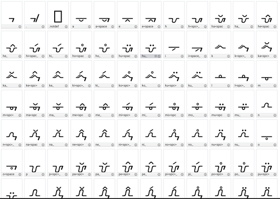
By having trailing space _also_ look different it takes 12 characters to add a new consonant.

This is just for 5 vowels & 6 consonants plus space & period.

On the upside, I've figured out the tricks to become faster at making the variants now.

Doing this with #BirdFont which is SO much better than #FontForge

#conlang #neography

@masukomi which version on Birdfont are you using? MacOS, full license? I found thr SIL OFL version to be a little lacking in terms of features, even though it looks nice
@dobody macOS SIL OFL. None of the limitations have mattered to me so far, but I am also only using this for my own language, not really making things for other people
@masukomi it looks great! In my experience I've found it quite troublesome not having many options for glyph points in BF, and I'm having a hard time wrapping my head around using it, even though it has the advantage over #fontforge to look like it comes from this century

@dobody re glyph points. if you're referring to the actual points on the bezier curves, some of the more complex shapes I just drew in Affinity Designer and exported as SVG then Imported that to BF. Worked great.

Re wrapping head around it: I found these videos helpful

official overview https://youtu.be/Z7qE5Y-tQyY
use in conlangs: https://youtu.be/KCmegUku-pE
REALLY useful tips if you need to do ligatures: https://youtu.be/H9mhS2Jbadg

Intro to Birdfont

YouTube
@masukomi thanks! What I mean by "wrapping my head around it" is less about learning to use it (i'm pretty much a play-with-everything learner) and more so about the general feel of it. The fact that I have no indicator of whether a control point is exactly horizontal/vertical, whether it's a curve or a corner point, etc confuses me, but then I'm mostly used to what I know from the FontForge "show everything" philosophy. That being said, it's still a solid and smooth font editor.