As good a day as any to remind myself that the way most of us has been taught the size of countries is misleading as hell.
@j_bertolotti @osma If you "compress" any projection, its properties change. In the case of Mercator, it become not conformal, for instance... so it is not a Mercator projection anymore. Distorting any projection when you want to show how it distorts itself is not fair.
You can add more map in the north and south, as in https://mapstodon.space/@jjimenezshaw/112168427319567417
but not distorting the map. Just adding that area.
It would be nice also to point how the "globe" projection in the left is also distorting.

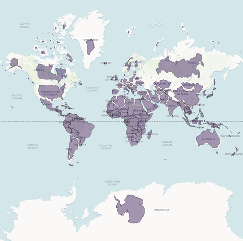
Attached: 1 image Mercator projection is not a conspiracy of northern countries. It is a conspiracy of the southern penguins! Look at the size of Antarctica. It is HUGE! (actually it is infinite) Somehow they convinced the mapmakers to remove most of it from those maps, saying that a square map is ... nicer? #gischat #mercatorprojection
@jjimenezshaw Feel free to make your own animation. I am not stopping you.
Anyway, I used the foirmulas here https://en.wikipedia.org/wiki/Mercator_projection#Derivation to generate the projection.
