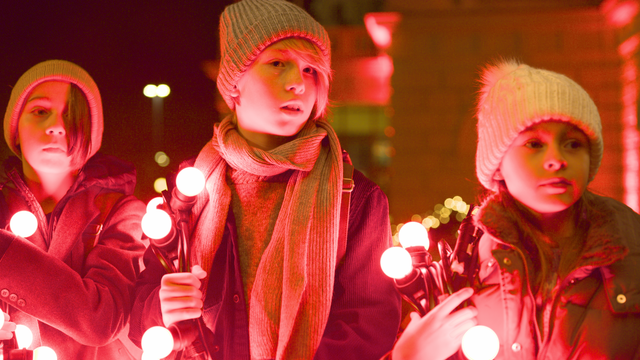
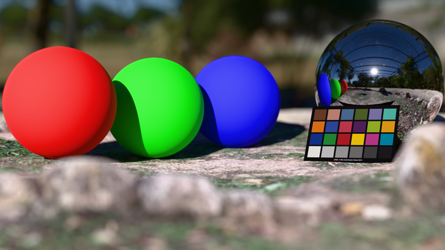
So, which tone mapping operator should I use nowadays to get a good looking result across all images? The last time I did this was something like 20 years ago? :)

I'm not interested in giving the user options to fine-tune the look, the default should be good enough. Unlike some, say, KDE applications, which give zero fucks apparently.

GitHub - h3r2tic/tony-mc-mapface: A cool-headed display transform

A cool-headed display transform. Contribute to h3r2tic/tony-mc-mapface development by creating an account on GitHub.

GitHub
ToneMapping/PBR_Neutral/pbrNeutral.glsl at main · KhronosGroup/ToneMapping

A collection of tone mappers for the display of 3D graphics - KhronosGroup/ToneMapping

GitHub

@aras I implemented PBR Neutral (because it's pure math and doesn't require a LUT) and it looks a bit weaker compared to tony-mc-mapface. But then you start comparing the two by overlaying them, and the choice is no longer so easy.

(In the previous version of this post there was a typo in one of the constants, so I have done it all again).

@wolfpld @aras The bar photo looks way better with Tony, no?
@pervognsen @aras Obviously, but then you start looking at the details and the piano has unnatural highlights on the decorations.