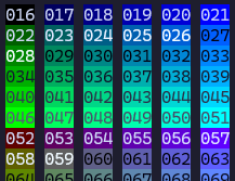
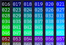
I've been messing around with colours in the terminal today and it's giving me a lot of appreciation for iTerm's "minimum contrast" feature, which can take almost unreadable output and turn it into something which is not too bad
feels like a really great way to fix problems where the colors are clashing for whatever reason (the orange bg is an unfortunate accident)
(first image is ngrok in my terminal without the "minimum contrast" rule, second rule is ngrok with minimum contrast set to 40)