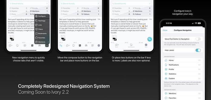
Ivory's upcoming new navigation design is currently available to test on TestFlight!

While the design of the navigation bar has changed over the years, the core concept of how it functioned has been the same since Tweetbot v1.0 way back in 2011! We've redesigned and rebuilt Ivory’s navigation system from the ground up to be faster, easier to use, and more configurable.

This will ship in Ivory v2.2 along with some other great new features!

@ivory Will there be a way to hide the More button? It's been less than a day but it's driving me a bit mad. 😭
@mergesort That kind of uh...defeats the purpose. 😅
@ivory You could still have an entry point to customize the tab bar in Settings. I haven't adjusted my tab bar in years (aside from setting things up from scratch when I've had to reinstall), I can't imagine it's something people are doing often. I'm all for having it as an option for people who want access to more than five tabs, but practically speaking I only need 4, and leave a 5th that I mostly ignore, but now will have an extra button that's always there.
@mergesort Great for power users, but a nightmare overall for supporting new users. With an option like this, users will hide the more button, forget that it ever existed and when we add an important new tab button (or if they need to access a button that was hidden), they will never know it exists. Will think about it though. Definitely not something for this release. Our old tab bar system has been a support nightmare for many, many years. New users just never knew sections of the app existed.
@ivory @mergesort I want to second this request. The new More button feels incredibly clunky compared to the elegance of the old design. Being able to adjust the tab bar on the fly, with a single gesture, was great, and now I feel like I’m forced to chose between primary and secondary tabs.
@BenRiceM @ivory @mergesort I absolutely understand about the More button. I see it as a blind space that doesn’t affect my experience but provides a shortcut to other apps. I also like how clean an elegant the tab bar looks even full of icons.
@BenRiceM @ivory @mergesort +1 I don’t think discoverability issues should outweigh preferred configurations / muscle memory that are part of daily usage. Missing out on a new tab item could happen what, a couple times a year? Meanwhile those of us that don’t really have overflow items would now have to tap twice to get to an item that used to sit where the “more” item now sits.
@shantini @BenRiceM @mergesort Technically not missing out on a tab because you can now have 6 buttons (1 more than before) at a time assuming you aren't on one of the tiny phones.
@ivory @shantini @mergesort while I appreciate having that as an option, I think it makes the tab bar look overcrowded
@BenRiceM @ivory @mergesort same, and I don’t need 6 buttons!

@ivory @mergesort I haven't had a chance to use the new button, but I might recommend taking a step back and asking whether a tab bar is the right affordance for PRIMARY navigation to all the great functionality in Ivory.

Certainly, it's ideal for quickly jumping between sections. But if users are missing out on functionality, then maybe it's time to rethink navigation.

@mergesort @ivory This! It’s too cluttered for me and unnecessary for how I use the app.