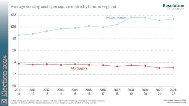
🧵 This Resolution Foundation graph comparing housing costs for renters and owner-occupiers again shows growing inequality under the ConDem and Conservative governments of the last 15 years. TBF it was widening under New Labour before that, too. This is important for many reasons 1/3 #UKPolicyCharts
Most importantly, it shows how INTERGENERATIONAL inequality is growing. The chart below from the shows the proportion of people needing help from their parents to buy, which rose to more than 50% in 2013-14. So the people paying 1/4 as much for their housing today are able to do so because they were born into a (comparatively) wealthy family #UKPolicyCharts 2/3
At the other end of the wealth spectrum, poverty is growing. This Health Foundation chart shows that three times as many people from people from Black, Black British, Caribbean or African backgrounds experience housing poverty compared to White people, again a gap that widened between 2010-11 & 2021-22. The UK is not just becoming much more unequal, but the growth in inequality is being 'baked in' by Tory, Labour and LibDem policies that promote home ownership. #UKPolicyCharts 3/3 Ends