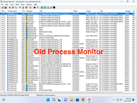
Every redesign of Process Monitor makes it demonstrably worse.
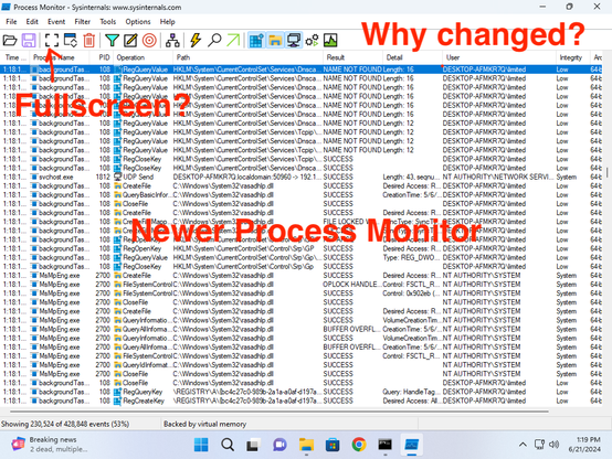
First round was to take recognizable icons and change both the icons themselves and also change how they indicate whether they are on or off. The icon that everybody recognizes as "make this fullscreen" was what you're supposed to click to start a capture?
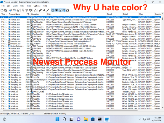
In the latest incarnation, somebody apparently decided that colors were old fashioned, and needed to go away. They do realize that for many, colors can help people distinguish between different things?
Isn't software supposed to improve over time? 🤦♂️