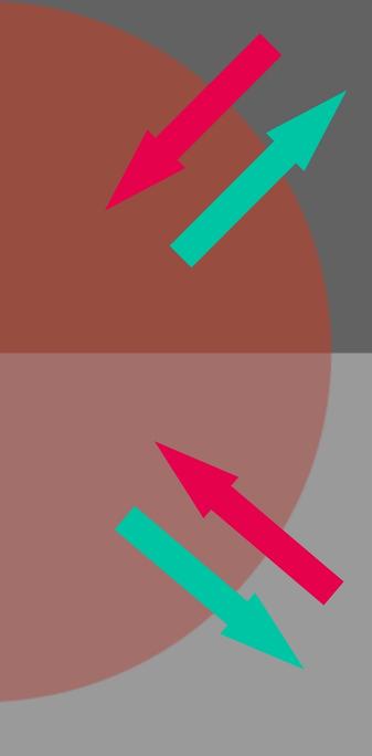
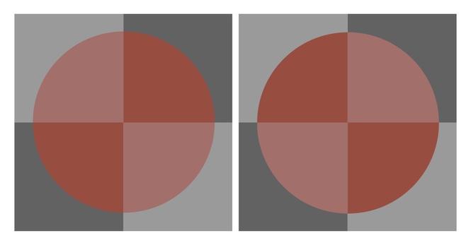
This still is đŸ€Ż to me with respect to the “fingerprint” of spatiotemporal articulations and how we create information.

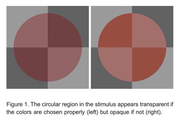
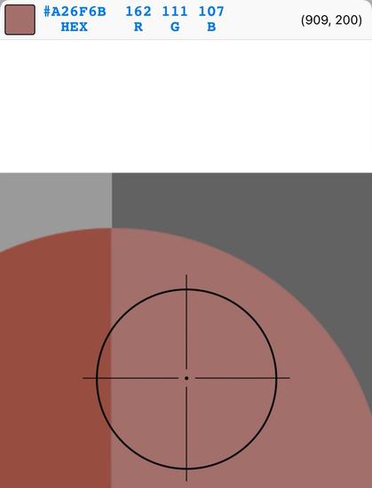
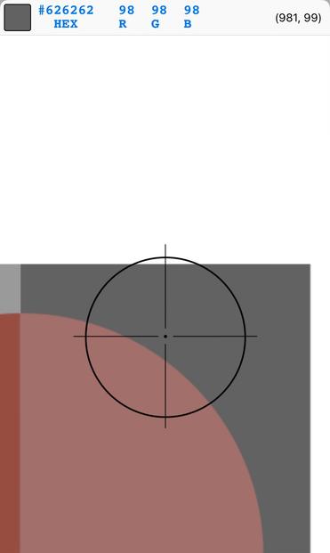
This is my riff on Ekroll and Faul’s work from 2011. Here, I chose to make the tristimuli **identical** in both depictions, with the sole difference is that the “disc”is rotated 90°.

The nature of the polarity along luminance vs chrominance triggers a strong probability of “transparency mode” in the first, while very low in the second.

The original had varying tristimuli, which in my opinion degrades the superimportance of the spatiotemporal articulation.

This demonstration is absolutely crucial to keep at the front of our lens when we hear the rabble discussing nonsense like “gamut mapping”.

There’s a 10000 thread at GitHub on CSS gamut mapping that is going to screw generations of web developers. https://www.w3.org/TR/css-color-4/#css-gamut-mapping

Folks really need to slow down and think more.

Never mistake motion for action.

CSS Color Module Level 4

So what all of these lines of thought succumb to is the brain wormed idea that “colour is stimuli”. We all know this is false, as the Ekroll and Faul demonstration shows with incredible persuasiveness.

So what **can** we learn from Ekroll and Faul? Is there a deeper pattern here?

I believe there is.

First would be to identify a key factor in the Ekroll and Faul demonstration. In my revision, given that the tristimuli are identical, we can get a sense that the local mean energy will be the +

- sole difference between the articulations. That is, we can expect the neurophysiological inhibitory opponent signals to be of similar gradient maxima and minima.

The key point is the polarity of the signal. What do we mean by “polarity”? This is the idea that there appears to be sizable indications that the information inference computations are grounded strongly by the energy “directions”.

Here, the arrows loosely identify the neurophysiological gradients of our biological assemblies.

If we ignore the nonlinear encoding OETF of the RGB, we can see rather clearly that in terms of the upper right quadrant, there is a unique energy progression. If we consider going from the disc to the ground, note the *minima* of the RGB. Why might RGB be useful for analysis? Because it is quite literally a normalized wattage.

All of this is rather interesting if we step back and fully appreciate that in terms of the neurophysiological signals, we are quite literally “hard wired” with energy analysis assemblies. The decrement signals could be broadly considered to be “energy down” gradient signals, and the increment signals are “energy up”.

If we compare to the low probability transparency mode upper right quadrant, we can see that the minima of the RGB uniquely “points” in a different direction.

I believe it is informative to think about the polarity gradient in terms of an “energy window”. That is, we can get a sense that the “energy floor” **could** be an important qualifier of the heuristic. In the “transparency mode” of the left side, the “form” of the “disc” has a *lower* energy floor on all four of the “wedges”. In the right form, the wedges *vary* in energy polarity. The upper right wedge is an increment to ground, and vice versa for the lower right.

So how might this related to pictorial depictions that matter more to image authors?

Let’s consider pictorial exposure depictions. Think about what we mentally imagine when we say “increase exposure”. There is a very unique mechanic that few stop to evaluate. Here is a simulated exposure sweep from @barselino, derived from a negative and processed under a custom chain.

This sort of a localised test strip picture is *incredibly* informative if we think about the “energy floor”.

For starters, it is not unreasonable to think of pictorial exposure as “layers of mist” or “layers of tissue” being “stacked” on the pictorial depiction. The key takeaway? The visual cognitive computation of “transparency” is *absolutely key* in our analysis.

And again, think about the “energy floor” as we progress left to right. Remember, RGB, after we remove the encoding transfer characteristic, is *normalized wattage*.

So it is very reasonable to ask ourselves what might happen if we “violate” this “energy floor”. How might we do this? Let’s think about what I call the “purity” for a moment.

What makes an RGB triplet less pure or more pure in terms of tristimuli?

A good number of people know that [1.0 0.0 0.0] and [0.0001 0.0 0.0] are identical colourimetric purity; the “distance” from the achromatic global centroid of R=G=B is the same.

So what here is “distance” if we reframe it as “energy”?

I have begun to believe that we can think about pictorial depictions as “fields”. That is, instead of “pixels”, it is useful to think of a given assembly as a series of variable “densities”. Think of it as a mip map representation for rendering wonks, or a series of progressively “blurry” versions of the same picture.

What is interesting here is that we can consider max(RGB) and min(RGB) of a given field, as an “energy window”. I’ve been riffing on the idea of an “energy cage”.

We know that our ganglion cells “pool” varying “field” dimensions of the bipolar cells. Varying the spatial “density” is a reasonable way to think about the “energy fields”.

It goes without saying that folks just look at this localised test strip picture and see “rectangles” of “exposure”. But how are we achieving this? This is a key question. What is governing the depictions of “a series of rectangular strips”?

If we consider a “very low” spatiotemporal articulation of the energy fields, we can get a sense that there’s a general progression along both “energy intensity” *and* “energy variation”. That is, as we start on the left side, the “energy cage” is very broad; we have a greater variability of purity, and our “energy floor” is lower. As we move right, the energy floor “lifts”, and our “energy cage” grows smaller; the purity is “caged”.

Key point: We can at least ask the question that *if* there is a reasonable “energy cage” heuristic going on, we ought to be able to “violate” it, and create a cognitive dissonance.

All of these are more of @barselino’s clever work. Here he matted out the strips so they are “continuous” as with the base exposure.

Notice the implications on the heuristics of decomposition as we compute the pictorial depictions.

All of this is to say: **Evaluate the professions of “gamut mapping” with a massive degree of scrutiny**.

Very, **very** few minds are asking the crucial question as to “What **is** ‘Gamut Mapping’?”

We ought to start with the idea of what we are trying to achieve, before spending thousands of posts waxing lyrical about nonsense. This is precisely what has happened with the CSS case, and other places as well. https://front-end.social/@leaverou/111491942156530717

+

Lea Verou (@[email protected])

I hate to say “I told you so”, but @svgeesus and I did warn browser vendors that shipping wide gamut support without gamut mapping would render these color spaces almost unusable. They thought we were exaggerating. They thought getting out of gamut is an edge case. They thought clipping was “good enough”. Well
 this is one of these times that I’m really not happy to have been right. 😕 https://github.com/w3c/csswg-drafts/issues/9449 Worse yet, the CSS impls are many folks’ first contact with these color models 😞

Front-End Social

- It makes me very angry that folks are stuck in this two century old idea of “colour is the stimuli”.

We need all of you wise minds to push back when this nonsense is peddled. When a “Uniform Colour Space” or “Perceptually Uniform Colour Space” or “Colour Appearance Model” is professed, it should be attacked. There is a disproportionate chance that *any such claims are pure bullshit*.

And the further we wire these garbage systems into garbage implementations, the harder it is to undo.

There is an impetuous march of “LET’S ADD WIDEZ GAMUTZ CUZ ITZ BETTERZ” when nothing is further from the truth. Such notions are as absolutely detached from reality as they are detached from the neurophysiological workings.

It shouldn’t take a rocket surgeon to look at carefully orchestrated demonstrations to realize that **the goals of “gamut mapping” as they are defined in the mainstream orthodoxy are ill defined at best**.

It is going to take the entire village to push this rubbish down, and undo the garbage being coded into our systems.

Good luck.

Here is a chromatic variation of the Ekroll and Faul transparent disc.

The tristimuli is identical in each in swatch, with the sole difference being the articulation of the “disc” is “rotated” 90Âș.

One should cognize subtle variations in the qualia of the colour between the two pictorial depictions.

@troy_s

"Careful they bite" ... I'm close to being done with certain standards organizations. Can you say "cognitive dissonance"?

"Oh but ProPhoto is bigguuur"
😳

@Myndex @Myndex It’s a stack of poop emoji, on top of a saliva glued stack of toothpicks, on top of a waterbed.

The inertia of things that do not work in *any* way, and the chorus of parrots


“bUT iT‘S a sTAnDarD!!1!”

@troy_s @barselino HA That's exactly what I thought you would do yes the effect is very prominent. Think of it as the light scattering in the fog would not allow this to happen

@chengdulittlea @barselino The correlation of the physicalist mechanisms of fog, while not rooted in the neurophysiological signals, *is* in fact why I feel it is valuable to think about the mean energy cages.

In the case of vision through atmosphere, the “floor” becomes the medium, which is effectively a “mean” of the energy bands of the medium. Even the purest of blacks to colours will attenuate in fog, or under a reflection.

@troy_s @barselino yeah, and the ultimate "mean" is decided with the lighting and scattering conditions, and all other stuff behind it will be averaged onto that value based on distance... well also a lot of other factors
@chengdulittlea @barselino I’d suggest the mean is neurophysiological based, and not entirely as elusive as some folks believe.

@chengdulittlea @barselino The key point I’ve been trying to make over the past while is that we can make a *reasonable* conjecture that there’s an energy conservation between the electromagnetic radiation and the neurophysiological signals.

Specifically, energy(radiation) will *always* be greater than energy(neurophysiological). The neurophysiological signals attenuate the incoming radiation.

All “Uniform Colour Spaces” and such *violate* this, in extreme ways.

@troy_s @barselino OOOh I get what you mean. Yeah that does make sense