I think I found my light and dark mode variants for my subscription screen for Wake Up Light 👨🎨
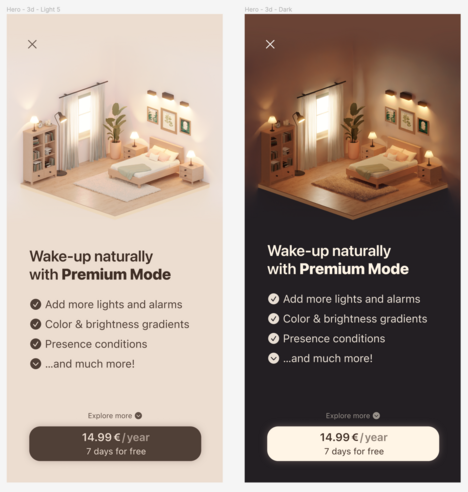
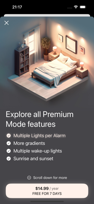
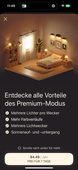
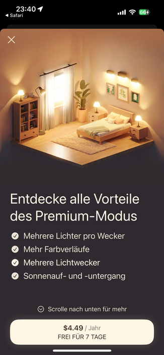
Back to the drawing board after AB testing! 😩
I was AB testing the new subscription screen (see prev. post) against the old one. This old screen had no dark/light variant, so everyone was looking at white on dark text. It was generated by an AI, so I have no possibility to change it much.
Turns out: The new screens (together) perform 35% WORSE in conversion rate. I don't know why. Anyone wants to guess? 🤔
(text is actually the same, just the image/colors were changed)