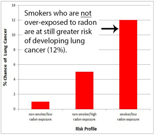
A chart from a 2018 dataviz 📊 study. This has melted my brain a bit.
The chart is meant to raise awareness about radon exposure and nudge people to get their homes tested. Specifically, it's meant to show smokers that they're at increased risk.
What effect do you think it actually has?!