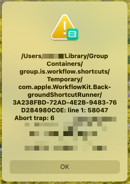
I can't hold it in any more. iOS-style error dialogs on macOS are terrible:
- They're sized for an iPhone screen. *stares in ultra-wide*
- The text is bolded and center-justified. Stylistically questionable, and unreadable to boot.
- Semi-transparency means it picks up the hues of the desktop background, and looks especially poor in this case.
I really want to know how this design ever made it past the mockup phase, never mind got shipped...