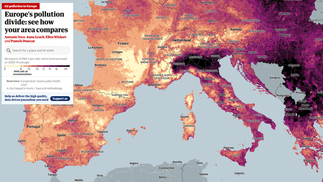
Fantastica mappa interattiva sul livello di inquinamento in Europa. Sapevo il nord Italia fosse messo male, ma non immaginavo tanto.
Fantastica mappa interattiva sul livello di inquinamento in Europa. Sapevo il nord Italia fosse messo male, ma non immaginavo tanto.