
In 2020 I wrote about the (quite bad) state of the dataviz accessibility of the US presidential result dashboards. Norway had elections this week, so you know what that means...
📣😎 I finally wrote something again! Good, bad, and interesting examples of the state of dataviz accessibility in the Norwegian media:
https://fossheim.io/writing/posts/dataviz-accessibility-review-norwegian-elections-2023/

Dataviz accessibility review: what we can learn from the Norwegian 2023 election graphs by Sarah L. Fossheim
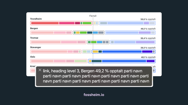
Now that Norway had its local elections, it's time for a closer look at the dataviz accessibility of the graphs used in the Norwegian media. Earlier this week the Norwegian news NRK reported that none of the Norwegian municipalities were conforming to web accessibility requirements, so I was definitely curious how the different charts would perform.