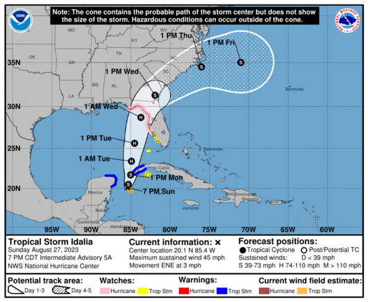
I don't understand why meteorologists and the #Hurricane Center continue to use the cone as the primary graphic for tropical storms.

There is a disclaimer that it shows the path, not the size, but the #design makes areas outside of the cone seem like they're in the clear.

Shouldn't the primary graphic for storms such as #Idalia show potential areas of impact?

@realityblurred wouldn’t that just be a larger cone and make more uncertainty?
@FuzzyWuzzy Good question! A cone showing possible areas of impact would be much larger. As I understand it, the current cone itself is pretty certain: it shows the possible location of the eye, and forecasting has made it better over the years so it's gotten narrower and narrower.
@realityblurred okay, so what if we kept the current cone but put it inside a larger cone that had stripes or shading to indicate potential areas impacted by winds and rain. This cone would get pretty wide though I would think. Maybe we just limit this cone to a 2 day projection? There would still need to be a note to inform readers what the cones mean and it is still up to the reader to comprehend that graph. Those, I think are the biggest challenges here.
@FuzzyWuzzy That’s more like it! But you’re right, more complicated. The Hurricane Center does issue graphics like these, just not layered on each other. For example: https://www.nhc.noaa.gov/refresh/graphics_at5+shtml/175343.shtml?tswind120#contents
TROPICAL STORM IDALIA

@realityblurred the layers of these graphics would be hard to read since they reuse of the same colors on things like wind and rain.