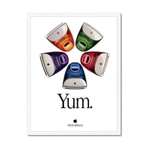
This ad poster for the iMac is utterly perfect. Perfect photo, perfect slogan (the period at the end is key — “Yum” without the period wouldn’t quite play the same way), perfect relative scale and placement of the elements. Even the kerning is perfect — Apple Garamond never looked better or more timeless.
@gruber it was perfect. You could almost pick them right off the page. Serif typography has lost its luster in our age but it is timeless and no company had owned a typeface like this since
@chrisgervais @gruber the u is a teency bit too close to the Y.

@jw @gruber Dare you question the hours spent in Quark Xpress and the numerous times Steve had his loupe out
@chrisgervais @gruber shift-option-command-bracket, if I remember correctly. :)