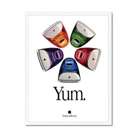
This ad poster for the iMac is utterly perfect. Perfect photo, perfect slogan (the period at the end is key — “Yum” without the period wouldn’t quite play the same way), perfect relative scale and placement of the elements. Even the kerning is perfect — Apple Garamond never looked better or more timeless.
@gruber it was perfect. You could almost pick them right off the page. Serif typography has lost its luster in our age but it is timeless and no company had owned a typeface like this since
@chrisgervais @gruber the u is a teency bit too close to the Y. 
@jw @gruber Dare you question the hours spent in Quark Xpress and the numerous times Steve had his loupe out
@chrisgervais @gruber shift-option-command-bracket, if I remember correctly. :)
@jw @chrisgervais Yup. Cmd-Shift-Brackets for big steps, add Option for small steps.
@gruber @chrisgervais In I logged a lot of miles on that program. We both quit print about the same time...
@jw @gruber My college paper was hardcore PageMaker so I only got to use Xpress for fun
@chrisgervais @gruber I came up in the newspaper/print trade and Quark/Illustrator/Photoshop paid the bills. :)

@jw @chrisgervais @gruber

I started out in a pre-press bureau… we had to know them all (& their diff. versions): Pagemaker, Quark, Illustrator, Freehand, Framemaker, & even Corel (God forbid. How I hated a job requiring I fire up a PC, & the guilt about postscript errors & wasted film!) Then there were your lesser knowns like Ready, Set, Go!

I developed a deep appreciation for fonts, but loathed ensuring I'd loaded the exact set a customer was using!

A great place to cut your teeth.

@rjbandicoot
That's where I learned the most. 2.5 years. 3rd shift, when the desperate designers came in to give us all their money.   
@chrisgervais @gruber