#searchmysite redesign just launched thanks to its first major open source contributor: https://blog.searchmysite.net/posts/introducing-the-redesign-and-first-major-open-source-contributor/
@michaellewis Hi, I'm sorry if I sound negative but I'd say that I preferred the older design.
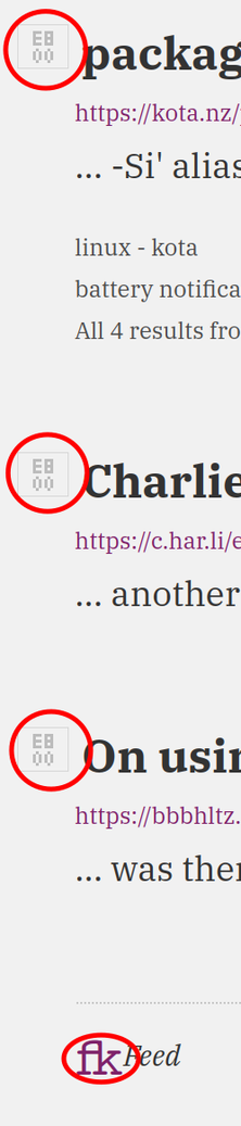
It looks the redesign introduced icon fonts on the website which not only expects that the user will download those icon fonts (which is unnecessary), if the user blocks those icon fonts, the website appears "broken". I've attached an image that highlights this issue.
The change on font weights when hovering on elements also introduces subtle layout shifts on the website. I've attached a video recording that shows this issue.
The information density on a page also seems to have been reduced significantly. I don't remember how many hyperlinks per page were displayed in the older design but I have to click through multiple pages to see search results in this redesign. A lightweight text focused website doesn't really need pagination, in my opinion, until at least 50 or 100 search results on a single page are displayed.
Here's a fairly large blog post with over 23 thousand words on a single page written by @Seirdy. There's no pagination involved and the page opens without issues even on a slower internet connection.
https://seirdy.one/posts/2020/11/23/website-best-practices/
Of course, giving users a choice about how many search results they want in a single page might be a better option.