Surprise! It's #fontbracket Qualifying Match #1! These playoffs will determine which typefaces get into the bracket tournament.

Poll is in the following post.
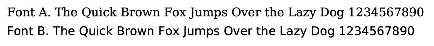
Font names are in the alt text. Vote before you peek!

Boost for visibility thanks <3
#fontbracketQM1

#fontbracket Qualifying Match #1:

Vote here. Font samples are in the previous post.

Which typeface do you prefer?

#fontbracketQM1

Font A
62.3%
Font B
37.7%
Poll ended at .

#FontBracket Qualifying Match 1

Déjà Vu Serif defeats Déjà Vu Sans
101-53*

*combining votes from masto and bsky

@sbarolo is there any way of including some punctuation? specifically question marks, exclamation marks, and ampersands? when i’m choosing a font, i usually check to see how the designer handles these (if at all).
@andrea_smandrea @sbarolo I always want to see the similar-looking pairs, lI and O0 come to mind
@sbarolo i don't like how that capital F looks on that serif
@sbarolo Interesting result. Everything about who I am would lead me to believe that I would prefer things streamlined and neat, so no serifs... but I had to be honest: the serif font was easier to read.