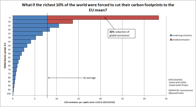
Charts like these – showing the immense carbon footprints of billionaires – should make us seriously question any exhortation on what "we" must do to address #ClimateChange (I'm guilty of using this phrasing too). Always ask: who is the "we"?


@steve did you find any histograms presenting this data within countries as well as globally?
Our world in data has this chart here, which does a good job of using the width of the chart to show absolute values across the income groups.
https://ourworldindata.org/co2-by-income-region
However, I’ve also seen charts showing how inequality *within* regions shows similar patterns, which goes some way towards addressing unfair country by country comparisons.
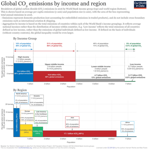

There are two parameters that determine our collective carbon dioxide (CO2) emissions: the number of people, and quantity emitted per person. We either talk about total annual or per capita emissions. They tell very different stories and this often results in confrontation over who can really make an impact: rich countries with high per capita emissions, or those with a large population.
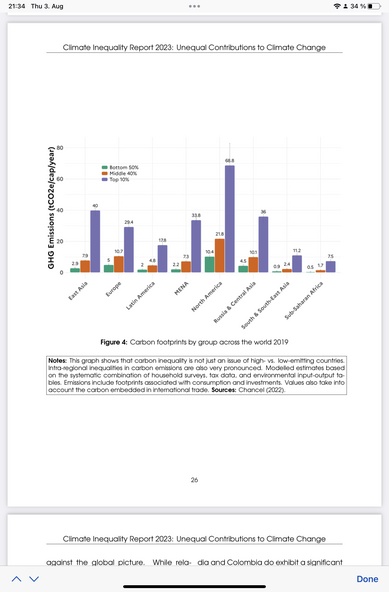
@steve ah, here it is, page 26 from the world inequality report for 2023. The grouped chart shows the similar patterns across each region., where even within the United states, you see the bottom causing significantly less carbon pollution than groups further up the scale.

Climate inequality report 2023, Fair taxes for a sustainable future in the global South The source for global inequality data. Open access, high quality wealth and income inequality data developed by an international academic consortium.
@mrchrisadams @mrchrisadams @steve @mrchrisadams @steve
The bottom 50% in the US isn't there because they are energy conscious, but because they lack alternatives; many want a better life that doesn't involve food insecurity or having to spend hours in transit every day. And they're roughly equal to the middle 40% in Russia and the top 10% in South Asia.
Should they or the asian 10% (or neither) be asked to cut?
