Rethinking Window Management on GNOME – Space and Meaning
Looks awesome, I can’t wait.
Looks really interesting, hopefully this can be a step forward for window management as a whole
Moving maximized windows to their own workspace seems like a really cool idea. Workspace management is one of the things I struggle with so I usually just end up with way too many tiled windows on a single screen when they could be moved around more efficiently.
That's pretty much how MacOS does, but I wouldn't call Mac's window management good by any means.
Yeah, I am regularly confused by it. I prefer having my maximized windows as normal windows in a virtual desktop. I can then minimize them and work with the windows below as usual. The MacOS approach is very different in that regard. I prefer managing virtual desktops myself, as it allows me to organize stuff and allows me to keep a simple overview of my virtual working layout in the back of my head. Dynamically changing the amount of virtual desktops/maximized windows is just too counterintuitive for my taste.
A good start would be to implement quarter tiling by dragging window to screen corner, like half tiling is done by dragging to screen edge.
I have a 3840x2160 monitor specifically so that I can have four windows open at the best size for their content (email, document, web browse, and terminal) and can avoid the use of workspaces and see everything at once. Having to manually resize and place windows is a pain.
Quarter tiling is huge on a 4K screen. I use a 4K screen when I’m doing YouTube programming videos sometimes and want to have OBS, a camera preview, an HDMI capture preview, and sometimes an app I want to put on screen open at the same time and quarter tiling is great for this. I currently have to use an extension to get this functionality on GNOME, but it would be awesome to have it built in.
Seems like quarter tiling is a nice start, with additional splitting when dragging a window over another as shown in the OP.
Have you tried the Pop Shell gnome extension? It allows you to toggle i3wm like window tiling. It’s also similar to Rectangle on macOS
I have tried it. It resizes windows weirdly. I haven’t dug through the settings for it, so it could be fixable. No matter how I resize my terminal, it always snaps to smaller than a quarter of the screen. Thunderbird seems to always resize bigger than a quarter of the screen. It’s still better than nothing, but I’d love for it to be built in.
Are they going to rethink putting thumbnails in the file selection dialog or many of their other insane decisions?
Gnome seems like they want to take the Apple approach to UI design without the attention to detail that Apple’s UX has.
putting thumbnails in the file selection dialog
Could you elaborate what you by this?
- in the file manager, you can see thumbnails of images and videos
- in the file picker (ie. “Open File” dialog box), you only see the filetype icon
They fixed that gamingonlinux.com/…/gnome-44-is-out-now-finally-a…

When you pick a file to upload or open from inside another application, the GTK/Gnome file picker does not allow you to have a thumbnail view of all the files. It is a meme in the Linux community at this point since there was a bug filed in 2004 asking for this feature, some even writing patches to make it work. Gnome devs refuse to change how the file picker works however.
I always disliked Gnome because of this and also because it seems like the developers want to force their tastes and use cases to everyone else. You either learn to work their way, or move out. That's one of the many things I like about KDE, despite the devs having their preferred default way of doing things, they leave options for the users to decide in an easy way (i.e. having everything in the settings menu, without needing to download and install a separate program or manually editing config files)
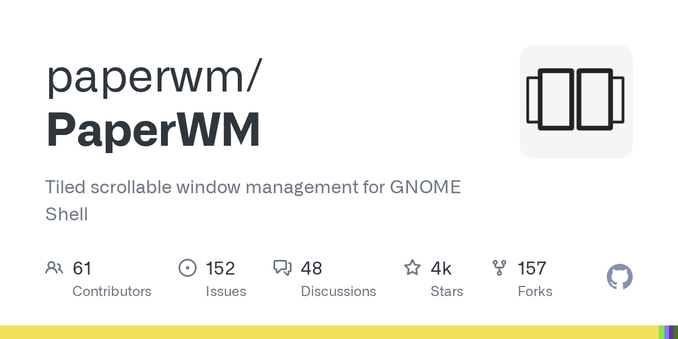
I’ve been using paperwm on gnome for a couple years now, it’s my preferred paradigm for tiling. This looks like it has a lot of the same influences, so I’m interested in seeing where it goes
I haven’t seen this paperwm. I’ll have to check it out.
PaperWM really should be its own DE. It’s so good, almost perfect, but held back by its nature of merely being a GNOME extension.
You’re not wrong about that at all. I thought about making a Wayland WM TM around that idea, but programming is work and not fun now so ¯_(ツ)_/¯
One important missing piece is having information on the maximum desired size of a window. This is the size beyond which the window content stops looking good. Not having this information is one of the reasons that traditional tiling window managers have issues, especially on larger screens.
I have been upset over losing this functionality from the classic Macintosh days for decades now. This was built into the Macintosh OS going back to at least System 7. Clicking the “expand” button in the title bar would expand (or shrink) a window to its optimum size. For Finder windows, that meant the smallest size that could display all the files without scrolling (if possible).
Developers had to implement logic to make it work. For the most part, they did, and it worked very well up through OS 9.
Then came OS X. The green button, at first, worked exactly the same way it did in OS 9. The problem was that even Apple didn’t give a damn to write any logic for it into their apps. It might as well have been a “randomize” button. Users got frustrated. Windows converts wondered why there was no “maximize” button and blamed the very concept of expanding rather than Apple’s now-piss-poor implementation. Longtime Mac users wondered why we effectively lost a very useful feature.
Over the years, Apple continued to neglect the function of the green button, and third-party devs largely followed suit. Eventually Apple changed the default behavior of the green button to go into full-screen mode, hiding the original (still mostly broken) “zoom” functionality behind an Option-click. At this point, the the difference is effectively “full screen” vs “windowed full screen”. RIP the classic Mac OS expand function.
Although the functionality is still abysmal, you can also double click the title/header bar to Zoom.
What is zoom in Mac. I never have mac, I’m curious 😂
Similar to maximize but it tries to expand only enough to show all the content without needing to scroll.
This looks cool. I might consider trying GNOME again if it gets implemented.
This is looking really great, and I want it now. Wish I didn’t know about it until just before I could use it :P
That would be really awesome! Especially if it could learn your preferences automatically by how you change the default arrangement.
As long as the windows are being maximised into a workspace you can jump to with
SUPER+[0-9], this seems interesting, if overly reliant on the mouse.
I love the direction this is going, I’ve been using i3/sway for years and gnome apps recently became awesome in tiling mode because of their responsiveness. If this is implemented this could definitely get me back on gnome 👍
Yes, I’ll definitely give tiling on Gnome a try again once this lands. Tiling mainly the reason I’m looking forward to System76’s new Cosmic DE.
Went tentative, left excited. Honestly it sums up my hopes for float/tiling window future.
Ive been using Pop OS which has their own Gnome extension (Cosmic? or Pop Shell?)for tiling/floating windows management and it works really well for me. Its toggle-able and adjust window size and placement pretty well imo.
If this becomes a Wayland protocol, then I’d love to see other desktops adopt it as well.
When I was using Gnome on a laptop, I really enjoyed the PaperWM tiling manager extension. It’s not exactly something that can be used with a mouse, but it’s a really pleasant touchpad/touch first multitasking interface, where instead of having traditional workspaces that are constrained to the size of your monitor, you basically get one infinite horizontally scrollable workspace.
So I’ve used the Pop Shell extension. It’s really neat when you have a bunch of little windows like terminals and file browsers open. 95% of the time it’s actively annoying though. I appreciate that it’s on a toggle so I can use it when I want it. The proposed mosaic mode doesn’t seem terribly different, and has the same problem where it just randomly moves things around breaking my association of “where I put that”. Most of the time I really need the spatial aspect, and am willing to manage a few windows by hand to get it.
Also: Joining half screen windows into a single unit?! Please don’t do it! D: Augh! Apple did that on OS X about the time I left and I absolutely hated it. It was so actively bad. :(
Looks well thought out, I’m interested! I think the biggest problem will be leaving the user enough control to modify the layouts after they’ve launched and not downsize apps after the user has upsized them and the like. As long as that is overcome this would be a fantastic way to use the desktop.
You can only focus your eyes on one window at a time. Alt-tab swapping between windows covers the vast majority of my use cases. Arranging windows next to each other to view them at the same time is a waste of time, other than a few rare use cases for me. What would be an improvement would be better ways to manage sets of windows to alt-tab through.