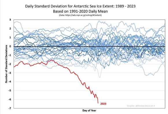
This chart is making the rounds and freaking out a lot of people, but what does it really show?

There’s definitely a detectable departure from recent historical averages this year. Here’s what the UC Boulder National Snow and Ice Data Center has to say about sea ice extent this year: https://nsidc.org/arcticseaicenews/

The question is: How well does the Antarctic ice recover when it peaks later this year? And what is the multi-year trend, especially as this year’s super El Niño fades?

1/2

Arctic Sea Ice News and Analysis | Sea ice data updated daily with one-day lag

It’s really too early to say how meaningful it is from a climate perspective, since it takes 10-20 years of data to form a recognizable climate trend.

If there is a shift from the 1981-2010 baseline, that’s useful to know but the meaning is unclear because we don’t know what that trend looked like pre-1981 with such high resolution.

If Antarctic ice doesn’t recover year after year after year, and then the same trend happens in the Arctic as well…then that would be significant.

2/2