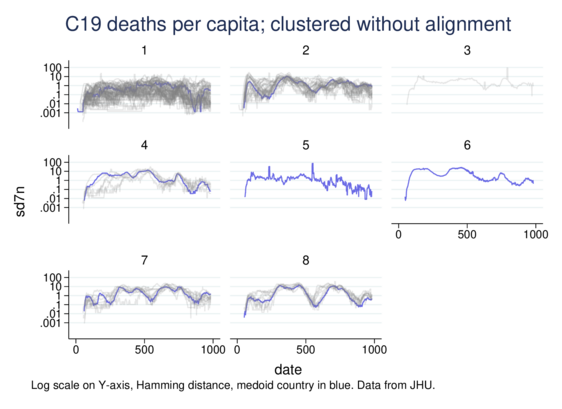
I've been upgrading my SADI code for lifecourse sequence analysis in #Stata (categorical time-series stuff, in effect).

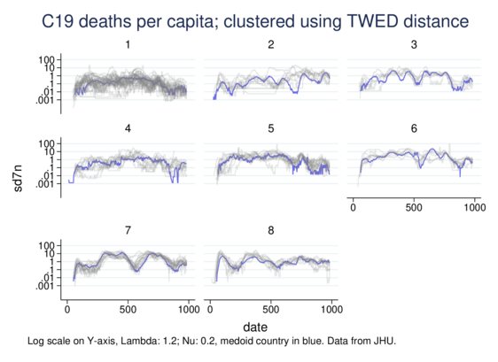
As a side exercise I adapted the TWED distance measure for continuous variables, not just categorical. Time Warp Edit Distance stretches and compresses the time axis to calculate similarity in time-series, allowing recognition of similarity displaced in time (with penalisation).

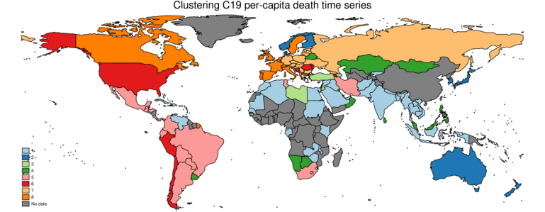
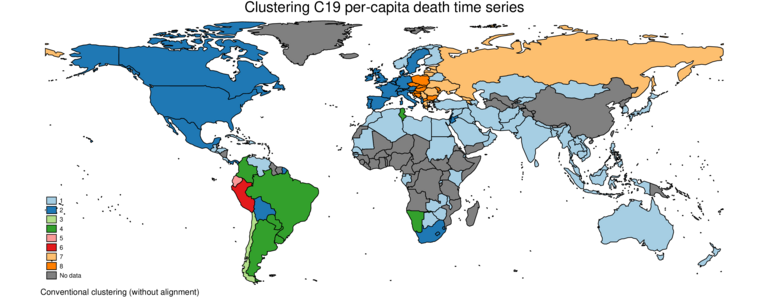
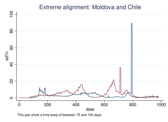
Here I cluster country-level COVID19 data, specifically per-million daily death rates.

There is a remarkable level of geographical similarity in this 8-cluster solution. Most of western Europe (except DE) is a group. Central & East Europe goes with Russia. Latin America is mostly pretty bad. The US clusters with Ecuador and Chile, Romania and Moldova, so not a really geographical cluster. Many tropical countries are in cluster 1, low deaths without much pattern. AUS NZ JP & NO FI DK make a low-deaths cluster but apparently Sweden isn't that Scandinavian.

Geography represents many things: clearly networks of travel and transmission, but also cultural and economic similarity. Quality of data may matter too: some of the poorer countries in cluster 1 may simply have not identified C19 deaths as much as richer countries (many of the poorest countries don't report any data).

Some clusters show much more marked temporal similarity (7 & 8 high, 1 pretty low).

Explanation: starting with C19 deaths per million data from JHU https://www.arcgis.com/apps/dashboards/bda7594740fd40299423467eb48e9ecf6 calculate pairwise similarity between all pairs of countries using Marteau's TWED adapted for a continuous variable. Cluster the resulting distance matrix, and examine.
Clustering on the Euclidean distance between the daily rates gives similar results, but with a little less geographical clustering, as it can't identify similarity with lags.
ArcGIS Dashboards

ArcGIS Dashboards

For info on TWED: https://en.wikipedia.org/wiki/Time_Warp_Edit_Distance#cite_ref-2
For info on SADI, in Stata do
net from https://teaching.sociology.ul.ie/sadi
net describe sadi
Time Warp Edit Distance - Wikipedia

An addendum: TWED measures similarity between time-series, allowing a certain amount of "alignment", i.e., recognising similarity that is near in time, but not at the same time (though penalising this displacement). It's good at recognising peaks that happen at about but not exactly the same time.

Running a conventional analysis (just summing the day-by-day difference) on the same data yields poorer results.

If you compare it with the first post in the thread, you will see that TWED picks up more similarity (clusters have similar time-profiles but individual countries are a little ahead or behind) and has a much easier job pulling out clear clusters.

More thoughts. TWED compresses/stretches time locally to detect matches displaced a little in time. We can check for the max displacement. This pair (Moldova and Chile) have a max displacement between 75 and 100 days. Clearly it's because of the late spike, due to crude updates to the figures.

In this case TWED is suboptimal: it's putting these 2 closer because of blips. But very few pairs have such a big displacement.

So MD and CL have a displacement of 75-100 days. Two more pairs have one of 30-40.

But only 1104 (of 7381 distinct pairs) have a displacement of 3+ days.

Only 2425 of 7381 pairs have a displacement of 1 day or more. {edit}

That is, in the main TWED does relatively little time-warping, but yet gives a much better result.

If we compare the unrestricted TWED distances with ones with a limit of 9 days' warping, the correlation is 0.999999. Despite the MD/CL example, practically all the important warping is within this small span.

On the other hand, the correlation between TWED and a no-warping comparison (i.e., a simple Euclidean comparison of day by day distances), the correlation is 0.836202: a pretty big difference. If we allow even 1 day of warping, the correlation with pure TWED is 0.999983.